
How to Use Google Stitch in a Real Design Workflow
A six-step guide to using Google Stitch from brief to handoff, with DESIGN.md rules and a table for choosing the right handoff route.
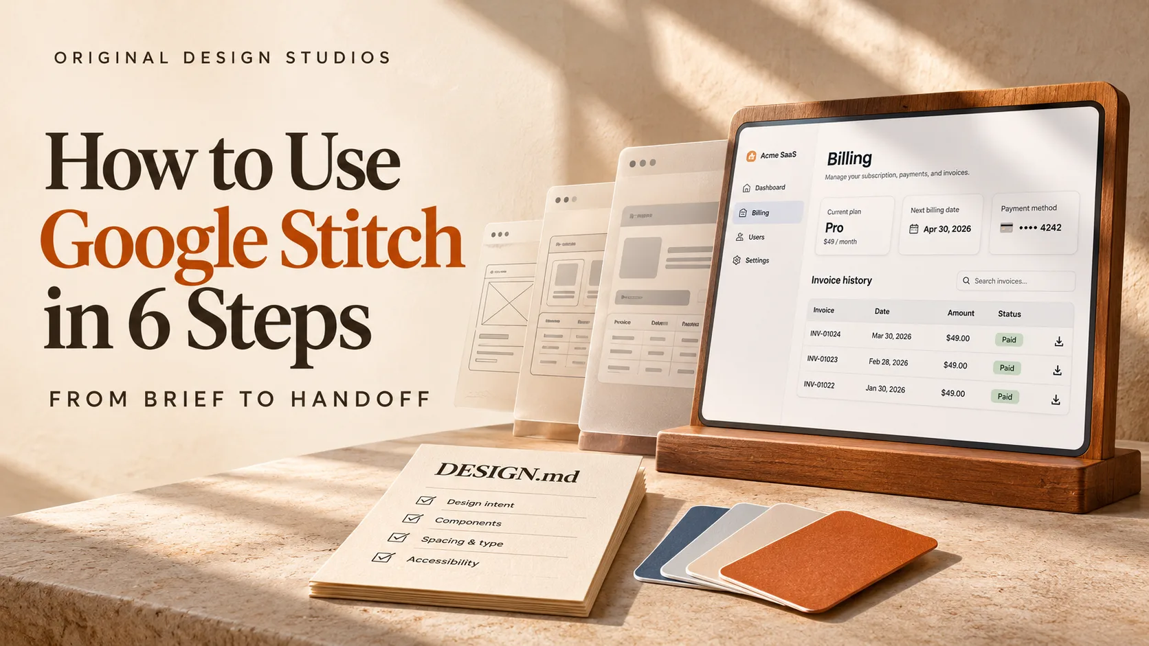
Google Stitch can turn a single prompt into high-fidelity UI, and that is where the risk begins. The screens look finished, yet a generated screen says nothing about why each choice was made. A convincing dashboard can hide a confusing navigation structure. Two screens can look consistent while following different spacing rules. By the time engineers receive the files, nobody can say which decisions were deliberate.
Knowing how to use Google Stitch well means keeping that record yourself. Fast Company's coverage notes that Figma still anchors professional design work, so the practical question is which stage of the process Stitch should own and where a person must stay in charge.
This guide works through a billing dashboard redesign and marks each point where generated output needs a human decision. The first of those points arrives before the first prompt is typed.
Where Google Stitch Fits in a Design Process
Google Stitch is a Google Labs design tool built around an infinite, AI-native canvas. The canvas accepts mixed inputs such as images and code as context, and a design agent reasons across the whole project instead of answering one prompt at a time.
Design work has a cheap end and an expensive end. Layout direction and first-screen content sit at the cheap end, where a wrong call costs an afternoon. Information architecture and accessibility commitments sit at the expensive end, where other people build on top of the call. Stitch is strongest at the cheap end, and its speed is also the risk, because quick progress there can carry unexamined choices into the expensive end without anyone deciding to let them through.
The six steps below slow the process down at that boundary. Before starting, line up three things.
A sceptical reviewer: One person whose job is to question generated choices before they harden.
A destination: A rough idea of who receives the output, which Step 6 turns into a routing decision.
A place for notes: One shared location for the brief, the reason behind the chosen direction and the rules file.
With those ready, the next move is opening Stitch.
Get Started With Google Stitch
Opening Stitch needs only a browser and a Google account.
Open Stitch in a browser. Nothing needs installing.
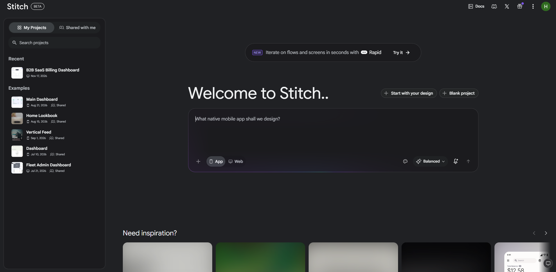
Sign in with a Google account.
Start a new project and choose web or mobile. The billing dashboard in this guide is a web design.
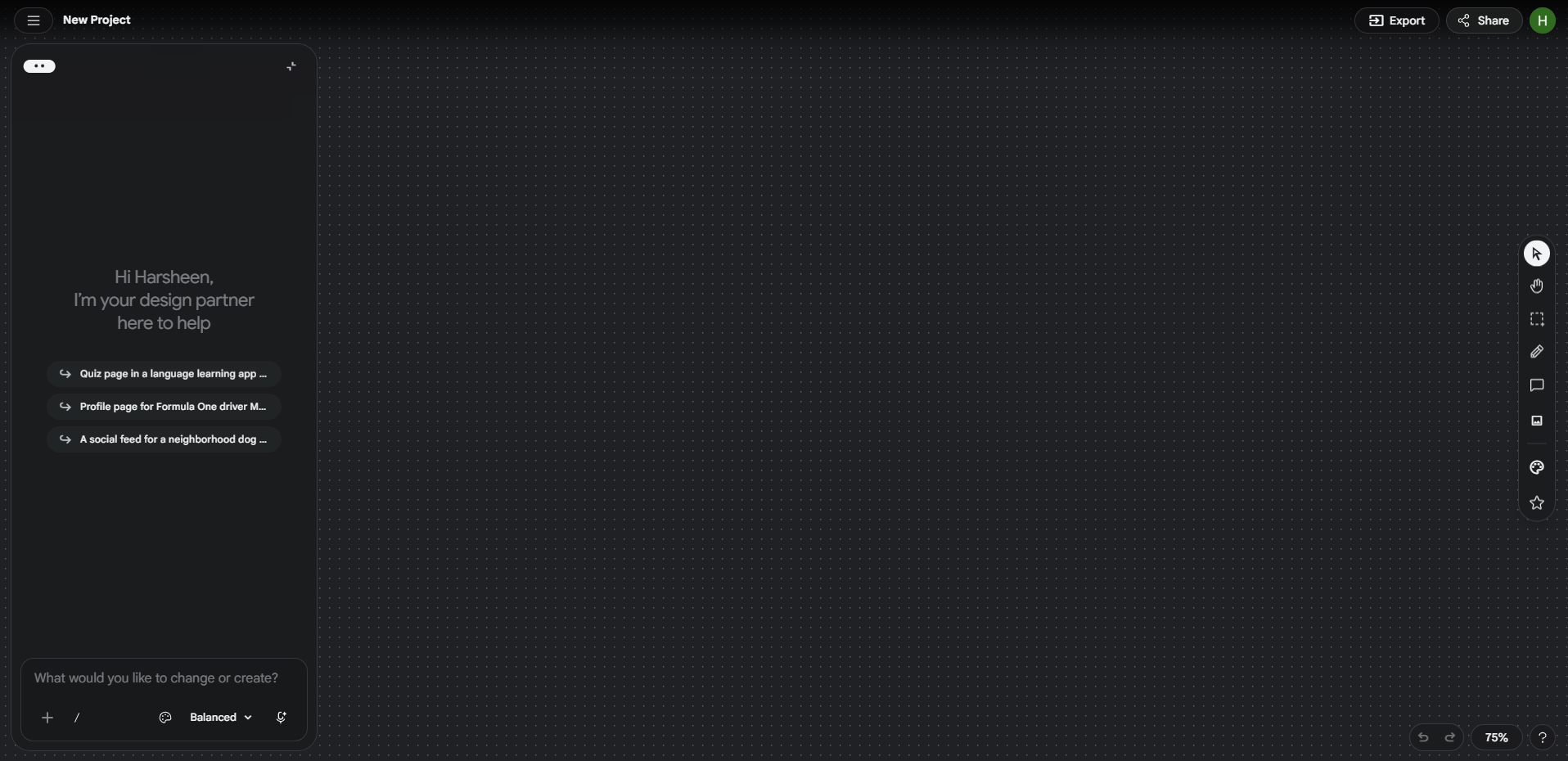
Paste a prompt or speak one.
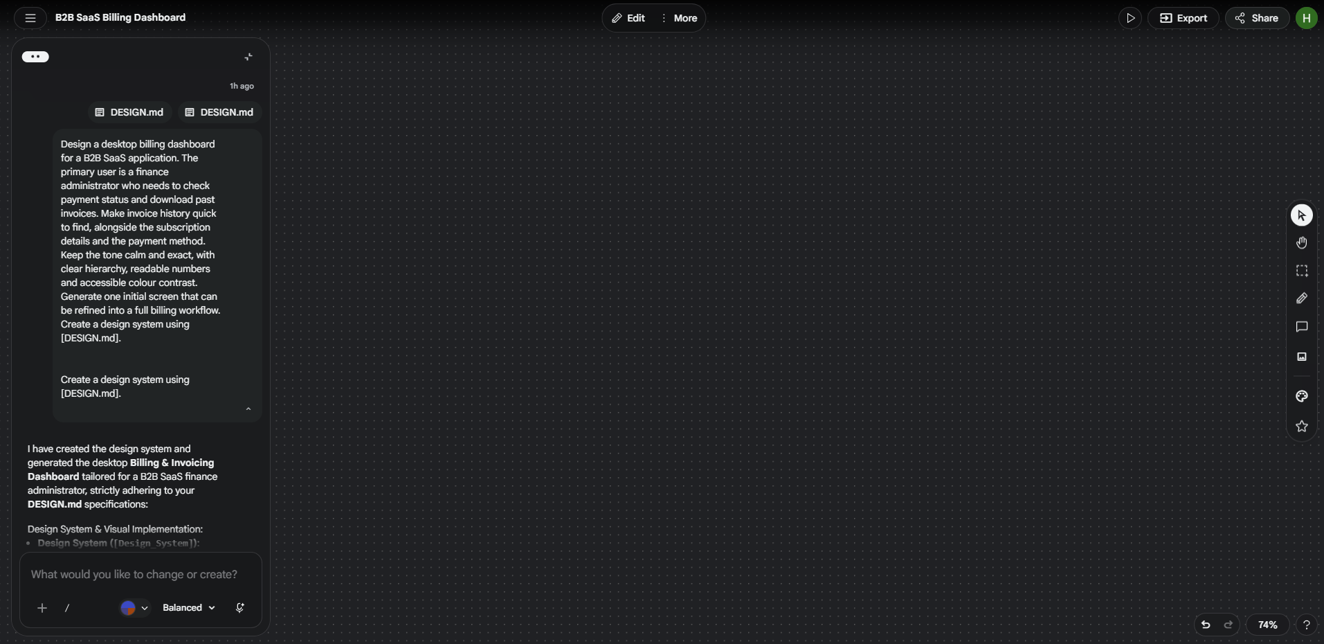
Read the first result before changing anything. Then refine it in the chat.
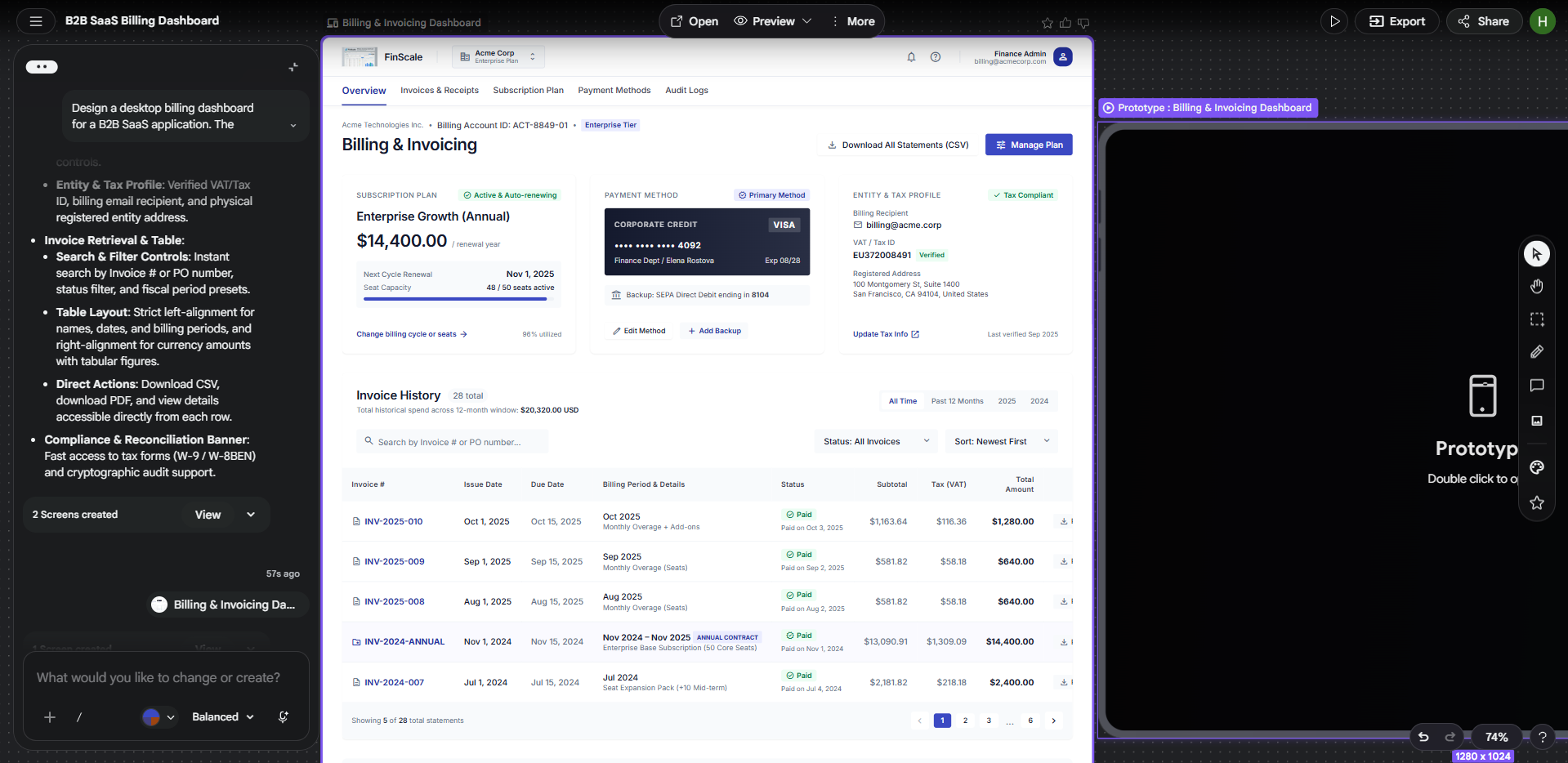
Steps 1 to 5 of the workflow happen inside Stitch and need no code. With Stitch open, the first real task is writing the input that every later screen will inherit.
Detailed Steps To Use Google Stich In A Design Workflow
The following six steps show how to use Google Stitch, from writing a clear design brief to refining interfaces and preparing them for development, using a billing dashboard redesign as an example.
Step 1: Write the Brief First
Every screen Stitch produces reflects the prompt behind it, so the brief is the real design artefact. Google suggests starting from intent instead of a wireframe. The running example is a SaaS billing dashboard where customers keep contacting support because they cannot find past invoices or confirm that a payment went through.
Name the user and the outcome: For the billing dashboard, that is a finance administrator who needs to download last month's invoice in under a minute.
Describe the feeling: Pick adjectives and give a reason for each, such as calm and exact because the screens handle money.
Add references: Use two or three, each with a note on what to borrow, since a bare screenshot invites imitation.
State the constraints: Give the platform and any content that must appear, such as desktop width with an invoice table and a date filter.
Combine the four lines into one prompt: Leave layout open, because fixing it too early can stop the agent from proposing a better one.
Design a desktop billing dashboard for a B2B SaaS application. The primary user is a finance administrator who needs to check payment status and download past invoices. Make invoice history quick to find, alongside the subscription details and the payment method. Keep the tone calm and exact, with clear hierarchy, readable numbers and accessible colour contrast. Generate one initial screen that can be refined into a full billing workflow.
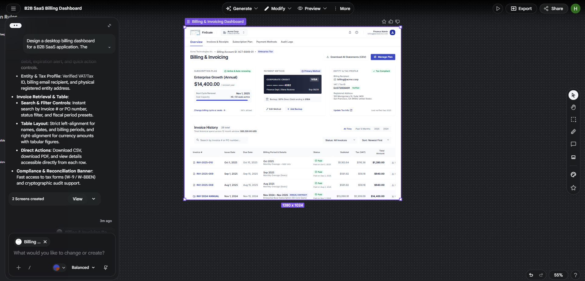
For a redesign, Stitch also accepts an existing codebase and design files as starting points, so the work can begin from what already exists. Writing the brief first surfaces disagreement early. If two stakeholders describe the feeling differently, it is better to learn that before generation, when the cost is a conversation instead of a rebuild.
The step is done when someone unfamiliar with the project can say who the screens serve and what the main action is. Until then, more generation only multiplies the confusion.
Step 2: Explore Directions, Then Commit
Pick the direction before polishing anything, because polish on the wrong structure is wasted.
Ask for directions that differ in structure: Stitch's Agent manager tracks progress and lets several ideas run in parallel, and variations in colour alone teach little. For the billing dashboard, one direction leads with subscription status and summary cards. That suits administrators who monitor billing closely, but it makes an invoice hunter scan past material they did not come for. The other leads with the invoice table and gives plan details a supporting column. That serves the most common task and gives subscription settings less prominence.
Judge every direction with the same three checks:
Task path: Count the screens between the entry point and the main action.
Content fit: Swap placeholder text for real labels, dates and amounts, since real content changes what a layout can hold.
Feeling match: Compare each direction with the adjectives in the brief.
Commit and write the reason in one sentence: For example, invoice history gets the largest area because retrieving billing documents is the dashboard's main job.
We would rather see two structurally different directions than six palette swaps, because only the first kind forces a real decision. The one-sentence reason becomes the first line of the design notes, and it gives the team a basis for judging any later suggestion to swap the table for large summary cards.
Done means one direction is chosen and its reason is on file. That choice only lasts if later screens inherit it, which is the job of the rules file.
Step 3: Lock the Rules in DESIGN.md
A chosen direction drifts unless its rules are written down.
DESIGN.md is an agent-friendly markdown file that exports and imports design rules between projects and other design and coding tools, and Stitch can also extract a design system from any URL. Google has open-sourced a draft specification so other tools can read the format. It is meant to carry the reasoning behind a design system as well as its values, and agents reading it can know what each colour is for and check choices against WCAG accessibility rules. The specification is still a draft, so treat the format as useful but not final.
Write each rule with its intent: The excerpt below shows the level of detail worth aiming for, with a stated intent, a role for each value and table behaviour written down.
markdown
# Billing Dashboard Design Rules

## Design intent
Prioritise invoice retrieval and financial clarity. Keep decoration minimal.

## Colour roles
- Primary action: #2457C5
- Main background: #FFFFFF
- Primary text: #172033
- Error: #B42318

## Typography
- Font family: Inter, sans-serif
- Page title: 28px / 36px, semibold
- Body: 16px / 24px, regular

## Spacing
- Base unit: 4px
- Scale: 8, 12, 16, 24, 32px

## Invoice table
- Left-align names and dates
- Right-align money amounts
- Keep download actions keyboard accessible

## Accessibility
- Target WCAG 2.2 AA
- Do not signal payment status by colour alone
Treat the values as unproven: The hex values and sizes above are invented for the example and need testing in the rendered interface.
Check type and contrast outside Stitch:
Type: Settle the scale before screens multiply. A ratio of 1.25 suits general interfaces and 1.2 suits denser ones, and the type scale tool previews both at real size.
Contrast: Check the whole palette instead of single pairs, because failures hide in combinations nobody tested, such as placeholder text and disabled controls. The colour accessibility checker tests up to twelve colours against WCAG 2.2, and its fix changes lightness only, so the hue survives.
Record exceptions with reasons: If invoice tables use tighter spacing than content cards, say why, so an agent or a developer meets the reason along with the rule.
Store the file with the project and name the person who approves changes to it.
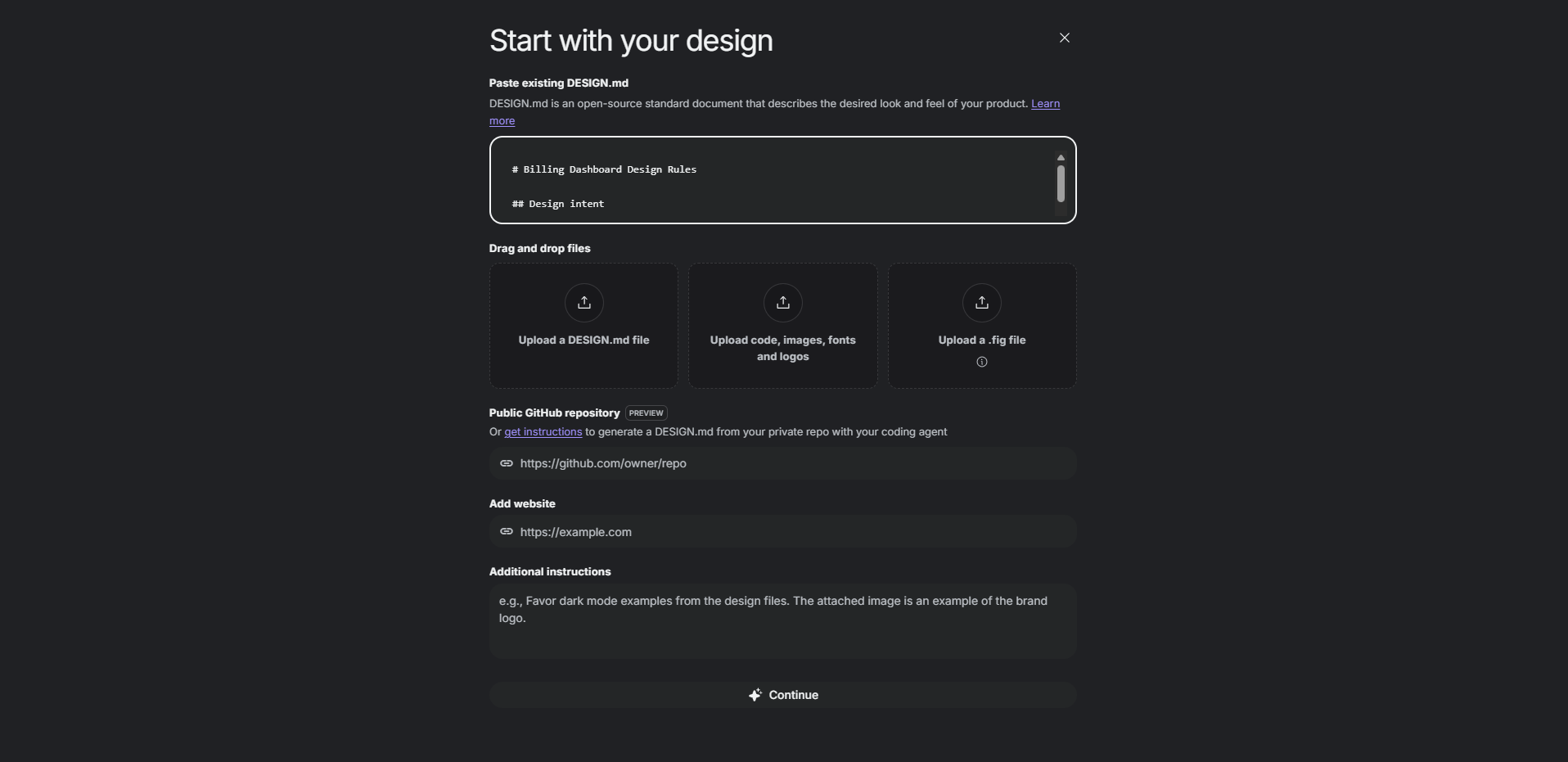
You are ready for the next step when another designer could build a new billing screen from the file without asking you to explain each choice. With the rules written down, the agent can be pushed hard on details without leaving the system.
Step 4: Steer the Agent Live
Most design time goes into revisions, and Stitch changes how that time is spent.
Stitch streams its work to the canvas as it runs, and the Stitch Agent can be steered before an iteration finishes. Voice works too, and the agent can give real-time critiques or rework a screen in response to requests such as three alternative menus or the same screen in other colour palettes.
Redirect early: Interrupt the moment a layout drifts instead of waiting for the finished pass.
Name one problem and one constraint per prompt: Three prompts for the billing dashboard show the level of specificity to aim for.
Hierarchy: "Make the invoice table the dominant section. Reduce the emphasis on subscription details without removing them, and keep the current type and spacing rules."
Scanning: "Adjust the invoice table so dates, invoice numbers, amounts and download actions are quicker to scan. Keep amounts aligned and rows clearly separated."
Narrow screens: "Adapt this dashboard for a narrow viewport. Keep the invoice download action and make sure no financial data is cut off."
Review every revision against the brief and the rules. Asking the agent to critique a screen against the objective and feeling puts the brief to work as a rubric. Run the same check yourself with real data, because a narrower table can look balanced in a screenshot while invoice numbers wrap awkwardly.
Specific prompts beat requests for something "cleaner" or "more professional", because vague requests invite unrelated changes.
Stop iterating when each screen meets the brief and follows the rules. Screens that read well one at a time still have to work as a sequence.
Step 5: Prototype the Flow
Do the screens work as a journey, or only as pictures? A prototype answers that before engineers do.
Link the screens and click Play: Stitch turns static screens into interactive prototypes, and the agent can generate logical next screens from each click. Treat those as proposals and review them as carefully as the screens you asked for.
Run one real task with someone new: For the billing dashboard, a finance administrator needs an invoice from three months ago for an expense report. Say nothing about where to click, because a control they miss teaches more than any explanation of your intent.
Cover the states beyond the happy path: The studio's principle on designing the full set of states starts from the point that a finished screen is only one part of an interface. The table lists the states this dashboard needs answered before engineers invent them.
Situation | What the screen should say or do |
|---|---|
No invoices yet | Explain that none exist and what triggers the first one |
Search finds nothing | Say so, keep the query visible and offer a reset |
Download fails | Name the failure and offer a retry or a support route |
Payment overdue | Show the status, the amount and one clear next action |
Unusually long invoice names | Keep amounts and download actions readable |
Limited billing permissions | Explain which actions are unavailable without exposing restricted data |
Log what the prototype cannot verify. Keyboard behaviour, screen reader announcements and backend logic wait for the built interface.
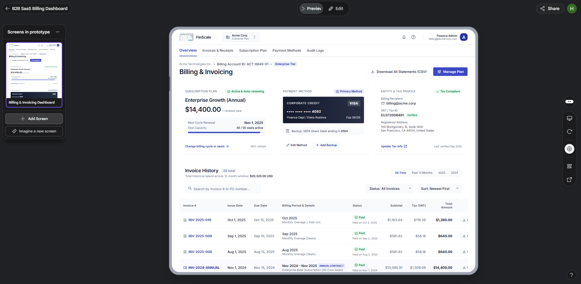
Each gap found here costs one more prompt, and the same gap found after handoff costs engineering time. Once a newcomer completes the task and every state in the table has an answer, the remaining question is how the work leaves Stitch.
Step 6: Choose a Handoff Route
Stitch offers several exits, and the right one depends on who acts next.
Pick the route by the next person's job.
Route | Who it serves | What travels | Check before using |
|---|---|---|---|
Shareable link through AI Studio | Reviewers and stakeholders | A viewable version of the design | Where feedback will be recorded, since a link carries the design and the discussion stays elsewhere |
Export to Antigravity | Developers | Screens, ready for backend logic to be added | That the rules file travels with the screens so the build follows the same system |
Publish with Netlify | Testers and clients | A live web version | Whether copy, permissions and any real data are safe for public eyes |
Copy to Figma | Designers who refine in Figma | Editable layers pasted into a Figma file | Whether your generation mode supports it, since availability has depended on the mode |
MCP server and SDK | Coding agents and scripts | Stitch's capabilities inside other developer tools | That the server and credentials are set up as Stitch's MCP setup instructions describe |
Send a short package with it. The route moves the files, and the package moves the understanding.
Approved direction: The screens that are final and the one-sentence reason behind them, so developers never choose between unfinished alternatives.
Rules and states: The current DESIGN.md file and the state table from Step 5, with anything the prototype does not show marked as open.
Constraints: Supported screen sizes, API dependencies and data permissions. Keep real customer billing data and credentials out of prompts and out of publicly reachable previews.
Remaining checks: What still needs validation, such as responsive behaviour, keyboard and screen reader support, security and integration testing.
Record provenance. The studio's Originality Charter asks for a generative-use log naming the tool and the person who stands behind each generated element. The same log suits a design handoff, because it answers where a screen came from before anyone has to ask.
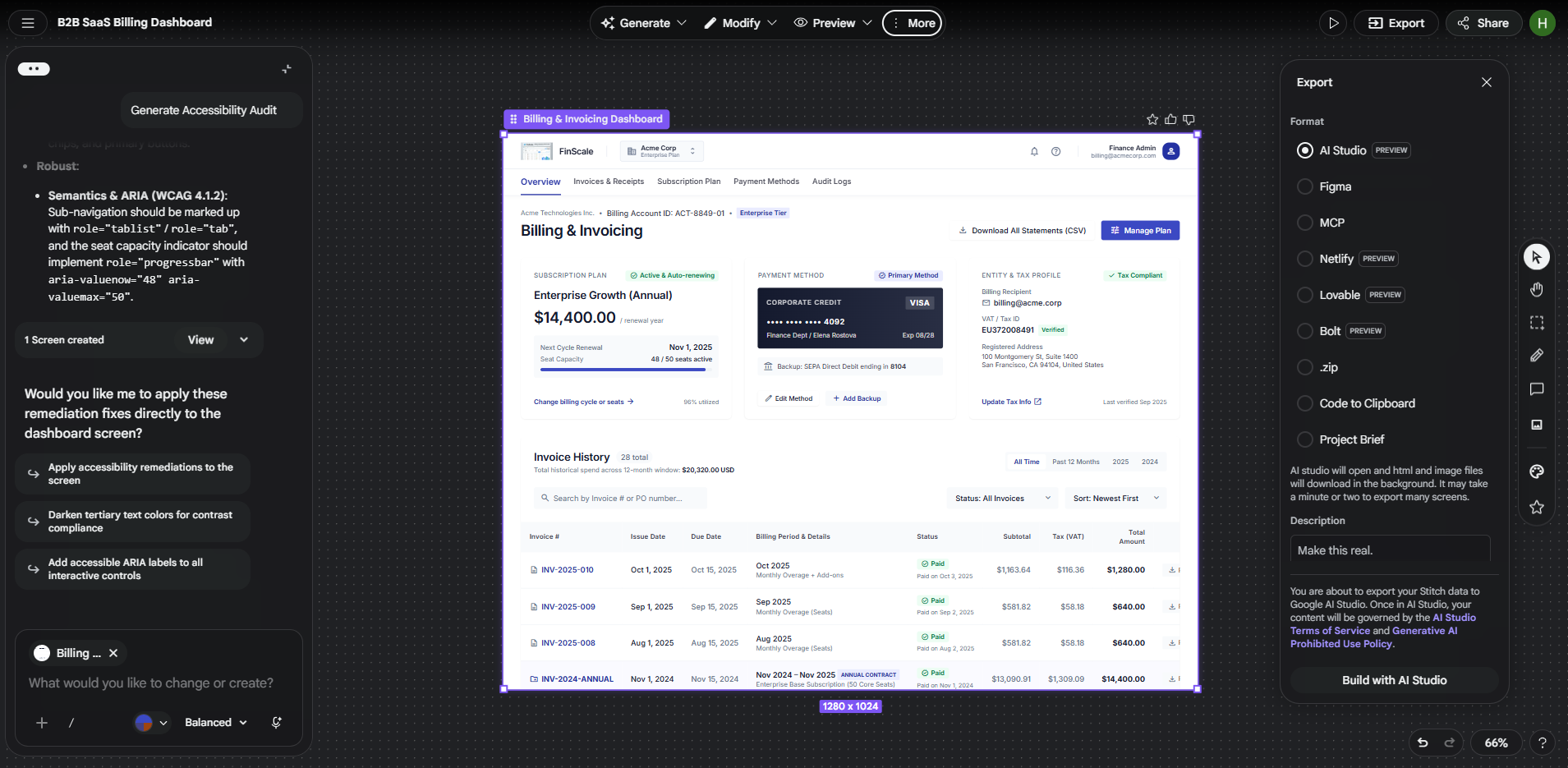
Handoff is complete when the receiving team can tell what was approved, what is still open and where each generated screen came from. They inherit only what was checked.
Teams that hand off to a coding agent should look closely at the MCP route.
Use the Stitch MCP Server With a Coding Agent
The MCP server lets a coding agent generate, edit and read Stitch projects directly instead of working from exports.
Google Labs publishes a library of agent skills for the server, built on the open Agent Skills standard and compatible with coding agents such as Antigravity, Gemini CLI, Claude Code and Cursor. The skills fall into three groups.
Design work: One skill generates screens from text or images, edits existing ones and creates variants. Others upload a DESIGN.md file and apply it to screens, or extract one from existing frontend code.
Build work: Skills convert Stitch screens into React components, and a Remotion skill generates walkthrough videos from a project.
Utilities: One skill turns a vague idea into a more specific Stitch prompt, which pairs well with the brief from Step 1.
Setup needs the server configured and running in the agent's environment, with credentials and environment variables set as Stitch's MCP setup instructions describe. Keep those credentials out of shared repositories and prompts.
One caution applies. The skills repository states that it is not an officially supported Google product, so test it on a small project before a team depends on it.
The Remotion skill is a useful extra, since a walkthrough video of the finished prototype helps reviewers who will never open Stitch. The studio's Remotion and programmatic video service covers that kind of work.
Automation speeds the handoff and also speeds the spread of unchecked output, so the review described next carries more weight.
What Still Needs a Designer
Handoff moves the files and leaves judgment where it was. Four areas stay with people.
Hierarchy: Check that the element carrying the objective also carries the visual weight. The studio's principle on how to make the reading order clear treats hierarchy as size, weight, position and spacing working together, so scan each screen without reading it and see whether the main subject and the supporting detail come through in order.
Accessibility beyond colour: Keyboard order and screen reader labels need their own review. Palettes need a second look too, since about one in twelve men has some form of colour vision deficiency, and a colour vision simulator shows which distinctions in a screenshot survive.
Trade-offs: A billing screen balances invoice retrieval against subscription management, and a generated layout proposes one balance without knowing which the business needs.
Real users: A walkthrough with a colleague finds dead ends, while sessions with the intended audience find the misunderstandings.
This raises the question most teams ask first, whether Stitch replaces Figma.
Google Stitch vs Figma
The evidence points to a split by stage, not a replacement.
Fast Company described Stitch's redesigned canvas as similar to Figma's and named Figma Make as Stitch's direct competitor. It still concluded that Figma holds the professional design workflow, and that designers of every level will reach for tools like Stitch at different moments, because a prototype is only the start of product design.
Start in Stitch: Exploring structure and producing a first prototype.
Refine where your team already works: Detailed polish, shared libraries and review stay with the tool your designers know, which for many teams is Figma. The Copy to Figma route in Step 6 covers the move.
Our view is that Stitch belongs upstream of a refinement tool.
Questions
4Do you need design experience to use Google Stitch?
Not to start. Google Stitch is for anyone from professional designers to founders with a first software idea, and the interface takes plain language. Experience matters at review, when someone has to judge hierarchy and accessibility, so a first-timer benefits from a reviewer with that background.
Is Google Stitch free?
Yes, As a Google Labs product, Stitch has been free to use, with monthly generation limits. Terms can change as Labs products mature, so check the product for current limits before planning a team workflow around it.
Can Google Stitch produce production-ready code?
Not on its own. Generated output is a starting point, so engineers still need to review the code, connect backend services, handle data securely and test behaviour and accessibility.
Is it fine to extract a design system from any website?
Stitch can do it, and the result is useful for studying how a product organises its rules. Treat the output as reference. Shipping another company's colours and type as your own invites confusion with that brand, so adapt the rules to your product's identity before they go into Design.md.
Conclusion
Anything Stitch can generate, it can generate again, so screens are the cheapest thing in the project. What stays scarce is a written reason.
This makes the DESIGN.md file more valuable than any single screen. It holds the reasons in a format that an open draft specification is trying to make portable, so a design agent in Stitch and a coding agent connected through the MCP server can read the same rules.
Two small experiments show where your team stands. Run one rules file through two tools and note where they interpret a rule differently, because each gap is a rule that needs a sharper definition. Then keep a ledger of what Stitch got right on each screen and what a person had to correct. Over a whole project it shows where review time belongs.
Rules files fail the way design systems usually do, through quiet abandonment, so keep the approver from Step 3 current. A team that wants those rules backed by a token architecture and governance can talk to the studio about its design systems work.