
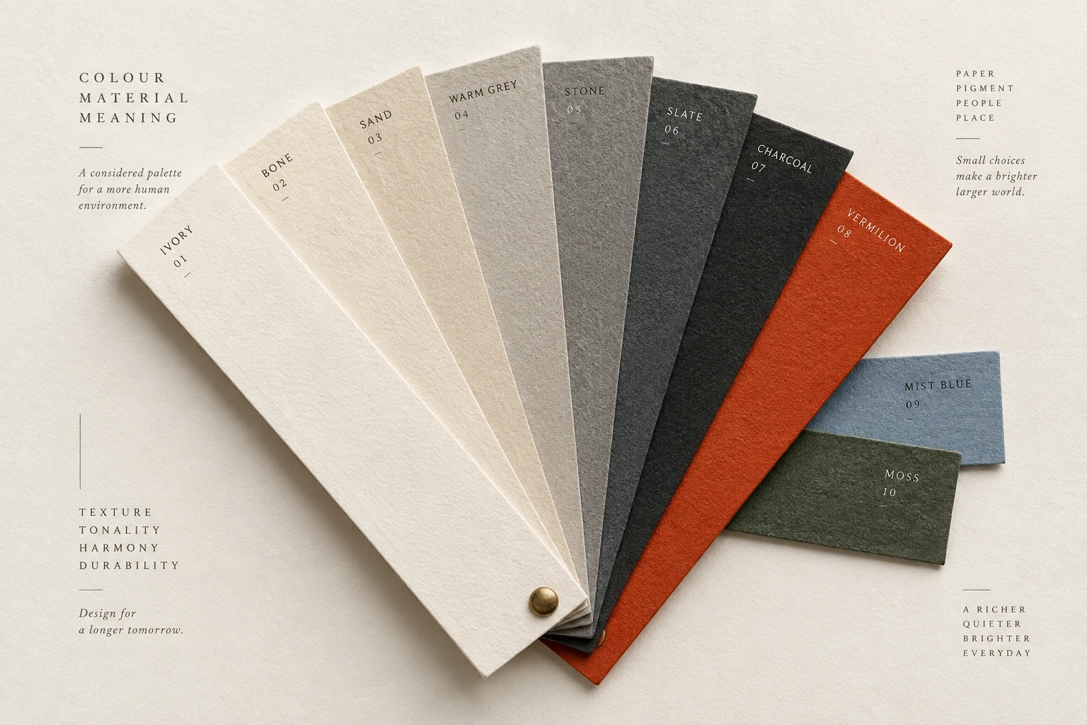
02 / Light

Colour

Use colour to support structure, attention and meaning. Build clear roles, check contrast and review the complete palette in light and dark themes.

Colour specimen
Principle 1 of 4 · 01Full entry

Establish structure before colour

The idea

Working in neutral colours can expose problems that a vivid palette temporarily hides.

If a label seems disconnected from its field, or two sections run together, address the spacing and hierarchy before adding another coloured surface.

Then introduce colour for the roles it needs to serve: identity, emphasis, grouping or status. Name reusable colours by their purpose, such as body text or raised surface. A greyscale review is a useful diagnostic, not proof that every colourful design is wrong. Check the final palette in the actual layout.

How to see it

Compare colour-led grouping with a layout that also uses spacing and neutral surfaces to establish structure.

Terms used in this lesson

The parts

Neutral palette
A set of restrained colours used for the main surfaces and text.
Colour role
The purpose of a colour, such as body text or selected state.
Grouping
The way related content is presented as a unit.

In practice

  • Establish grouping with spacing and alignment
  • Name colours by their role
  • Review the final palette in context

Avoid

  • Adding colour to conceal unclear grouping
  • Creating unused colour variants
  • Treating greyscale as a complete accessibility test
Test

Temporarily view the page in greyscale. Which relationships become unclear, and could a label, spacing change or stronger shape preserve them?

Use the Contrast Grid to check the text and surface combinations in your neutral palette before introducing accents.
Principle 2 of 4 · 02Full entry

Make contrast measurable

The idea

For WCAG 2.2 Level AA, normal text needs a contrast ratio of at least 4.5:1.

Large text needs at least 3:1: 18pt regular or 14pt bold, approximately 24 or 18.7 CSS pixels. The criterion includes exceptions, such as inactive controls and logotypes; it is not a single threshold for every visible mark.

Check the foreground and background colours used in the finished page, including placeholders and hover states. Over an image, the background can vary behind each word. A stable backing can help. Passing a ratio is a baseline: also review the type size, stroke strength and actual reading conditions. The W3C guidance linked below explains the requirements and exceptions.

How to see it

Compare the separation between text and background. Measure actual colour pairs rather than estimating a ratio by eye.

Terms used in this lesson

The parts

Contrast ratio
A measure comparing the relative luminance of two colours.
Large text
For WCAG minimum contrast, at least 18pt regular or 14pt bold.
Backing
A stable surface behind text that separates it from imagery.

In practice

  • Measure actual text and background pairs
  • Check interactive states and image backgrounds
  • Review thin strokes at the delivered size

Avoid

  • Rounding a failing ratio up to a pass
  • Assuming every element uses the same threshold
  • Using visual inspection as the only contrast check
Test

Check each text style in its real context. Record failing colour pairs, fix their shared styles, then review the affected screens again.

Use the Contrast Grid to check your text and background colours together and identify combinations that need adjustment.

Principle 3 of 4 · 03Full entry

Give accent colours a consistent role

The idea

An accent is useful when it helps someone find or interpret something.

If headings, borders, icons and actions all have equal colour emphasis, the page can become harder to scan. Decide which roles need emphasis before applying it broadly.

Use those roles consistently across screens. A primary action may share the brand accent, while warnings need a distinct treatment with explanatory text. There is no fixed number of coloured elements that makes a page work. Judge the balance against the task, and preserve meaning with labels or shapes as well as colour.

How to see it

Compare widespread accent use with a more focused treatment. Which action is easier to locate?

Terms used in this lesson

The parts

Accent
A colour treatment used for deliberate emphasis.
Status
A condition such as success, warning or error.
Secondary cue
A label or shape that communicates meaning alongside colour.

In practice

  • Define the purpose of each accent
  • Keep status treatments consistent
  • Pair meaningful colour with a second cue

Avoid

  • Emphasising decoration more than the main task
  • Changing a status colour's meaning between screens
  • Relying on hue alone to explain an error
Test

Look at the most prominent coloured elements. Do they draw attention to the right actions, and does the same treatment mean the same thing elsewhere?

Use the Colour Vision Simulator to inspect a screenshot for colour distinctions that need an additional label or shape.

Principle 4 of 4 · 04Full entry

Design light and dark themes deliberately

The idea

A dark theme needs its own colour choices.

Simply inverting a light palette can make imagery, borders and status colours difficult to interpret. Define roles such as background, surface, text, muted text and accent, then choose values for each theme.

Review whole screens, including forms, dialogs, charts and empty states. An accent may need adjustment to keep a similar visual emphasis, but there is no universal lightness or saturation offset. Check contrast in both themes and ensure that focus, selection and errors remain recognisable.

How to see it

Two themes using the same roles. Check whether the content and controls remain recognisable in each.

Terms used in this lesson

The parts

Theme
A coordinated set of colours and surfaces.
Semantic role
A reusable purpose such as background, text or error.
Elevation
A visual distinction between layered surfaces.

In practice

  • Map colour roles separately for each theme
  • Check forms, charts and dialogs in both
  • Review focus and selection states

Avoid

  • Assuming inversion produces a finished theme
  • Applying a fixed adjustment to every colour
  • Testing only the opening screen
Test

Switch themes on a complete task. Can you still read the supporting text and identify every state, boundary and action?

Use the Contrast Grid to check each theme's palette separately, including muted text and raised surfaces.

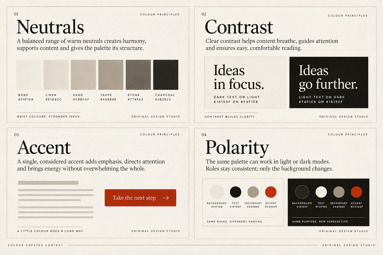
Colour, in practice

View full size ↗
Four visual examples of colour: establish structure before colour; make contrast measurable; give accent colours a consistent role; design light and dark themes deliberately.

Four principles at a glance

  1. 01

    Establish structure before colour

    Use spacing, alignment and emphasis to build a layout that colour can support.

  2. 02

    Make contrast measurable

    Check text against its actual background, including interactive states.

  3. 03

    Give accent colours a consistent role

    Use emphasis deliberately so readers can recognise actions and status.

  4. 04

    Design light and dark themes deliberately

    Keep the meaning and readability of each colour role consistent across themes.

Apply it

Score your work against this discipline.

An audit reviews what you have shipped against all ten disciplines, tested with assistive technology and on real hardware, and returns a prioritised plan.