
01 / Setting

Typography

Make text comfortable to read and easy to navigate. These principles cover line length, type roles, optical alignment and visual hierarchy.

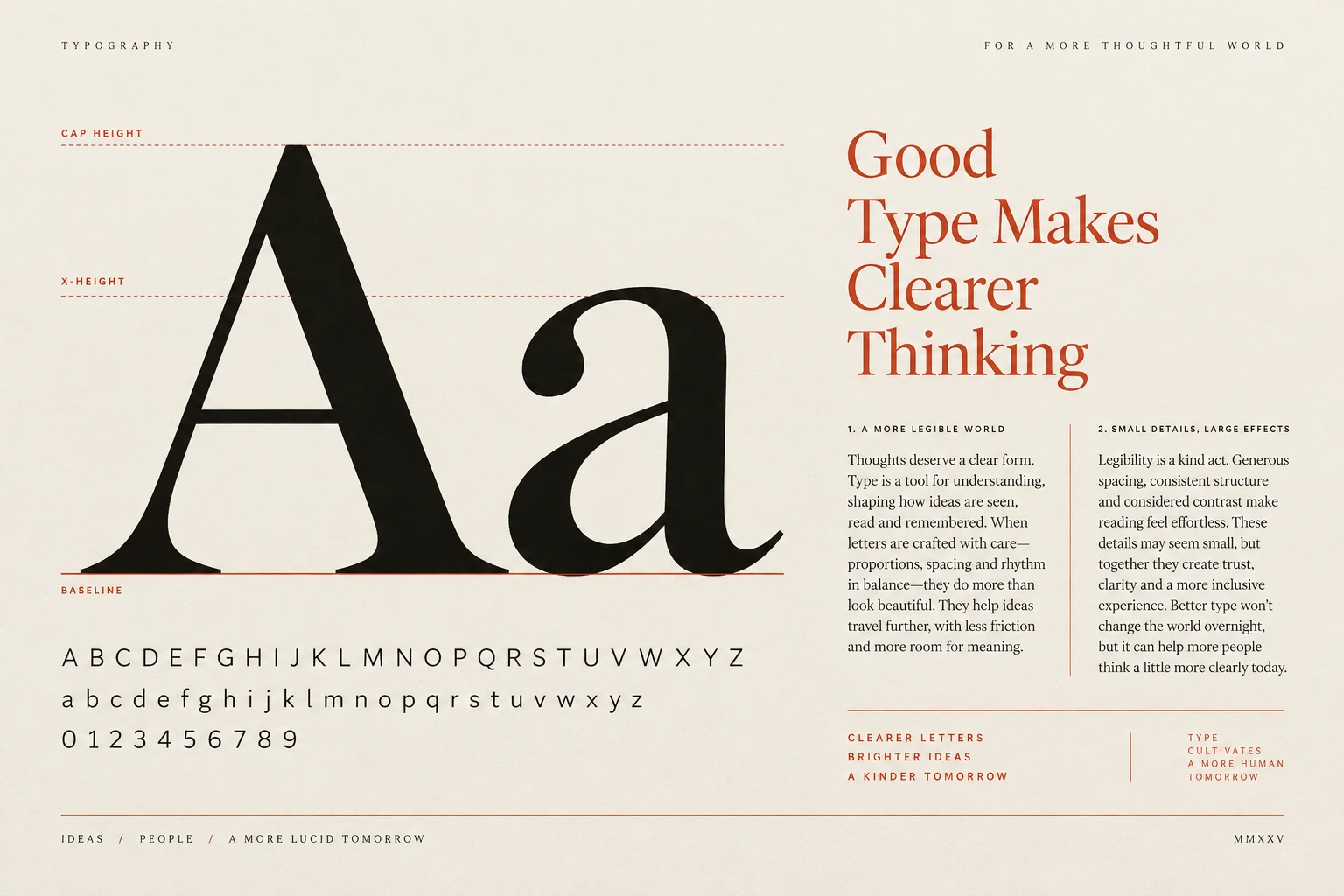
Typography specimen
Principle 1 of 4 · 01Full entry

Choose a comfortable line length

The idea

A paragraph should be easy to follow from one line to the next.

Very wide columns can make that return difficult; very narrow columns can interrupt the rhythm with frequent line breaks. The right width depends on the typeface, language, size and kind of content.

Start with a readable body size, constrain the column, then adjust the spacing between lines. Test a real passage rather than a short placeholder. On the web, a max-width in ch can help, but ch measures the width of the zero character, not an exact count of letters. Recheck when the font, viewport or text size changes.

How to see it

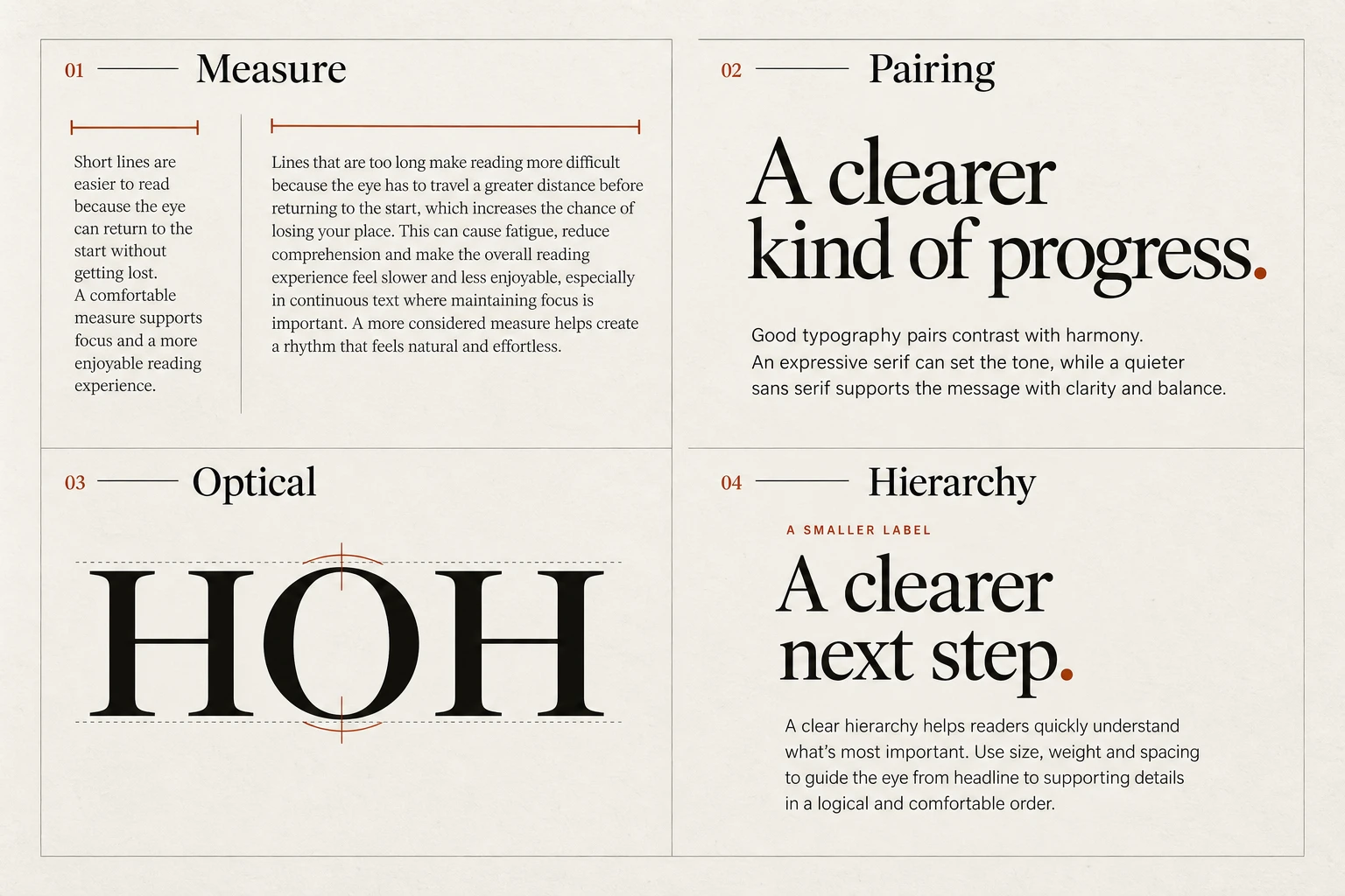
The same text in a wider, tighter column and a narrower, more generously spaced column. Compare the reading experience at your current screen size.

Terms used in this lesson

The parts

Measure
The length of a line of text.
Line spacing
The distance between consecutive baselines.
ch
A CSS unit based on the width of the zero character in the current font.

In practice

  • Test real paragraphs at the intended size
  • Constrain long reading columns
  • Recheck enlarged text and narrow screens

Avoid

  • Letting paragraphs expand indefinitely with the viewport
  • Choosing spacing from a short placeholder
  • Treating ch as an exact character count
Test

Read a long paragraph on a phone and a wide screen, then enlarge the text. Can you follow each line comfortably without horizontal scrolling?

Use the Type Scale to adjust the reading measure and base size, then compare the live specimen.
Principle 2 of 4 · 02Full entry

Give each typeface a clear job

The idea

Use a small, consistent set of type styles so readers can recognise what each part of the page does.

A typeface gives text a particular character, but readers also need to recognise what each piece of text does. Headings introduce a section. Paragraphs explain it. Captions describe an image. A consistent set of styles makes those roles easier to recognise as someone moves through a page.

Start with a family that works for your body text. Try it in a real paragraph at the size people will read, then use its weights and sizes to build headings and supporting labels. One family may provide everything you need. If the headings need a different character, introduce a second family and give it a specific role, such as titles and pull quotes.

When pairing families, compare them in the actual layout. A serif heading with sans-serif body text is one possible approach, but category alone does not make a pairing work. Check the proportions, spacing and emphasis together. Readers should be able to tell a heading from a caption because the styles are consistent, rather than having to interpret a new treatment in every section.

Treat two families as a useful starting constraint, not a universal limit. Additional scripts, an established identity or a distinct editorial purpose may call for more. Before adding another family, identify the need it meets and check whether an existing weight or style could meet it. Record the final roles with examples so the system is easy for others to use.

How to see it

First example: several treatments compete for attention. Second example: a clear heading, a quieter label and readable body text each have a distinct role.

Terms used in this lesson

The parts

Family
A related set of type styles, often including several weights and italics.
Role
The job a style performs, such as heading, body text or caption.
Display type
Type chosen for prominent, usually large text. Check it separately before using it for paragraphs.
Text type
Type chosen for comfortable reading in paragraphs at the intended size.

In practice

  • Define reusable styles for headings, paragraphs, captions and labels.
  • Compare font pairings with real content at desktop and phone sizes.
  • Use weight, size and spacing to create distinctions within a family.

Avoid

  • Avoid adding a family when an existing style already serves the purpose.
  • Avoid choosing body text solely because it looks appealing at headline size.
  • Avoid changing the type treatment for the same role from section to section.
Test

Choose a heading, paragraph and caption from three different sections. Does each role use a consistent style? If you remove one family, which useful distinction disappears? Keep it only when you can explain its contribution.

Principle 3 of 4 · 03Full entry

Refine alignment by eye

The idea

Equal dimensions do not always create equal visual weight.

A circle beside a square, or a play icon inside a button, may look misaligned despite matching measurements. Begin with a consistent grid, then inspect the visible shapes within it.

Make small adjustments at the size the work will be used. Letter spacing that suits a large title may not suit a caption, and the right value depends on the face. Use optical sizes when the family provides them, and compare the result before applying a correction across the system. Avoid turning one local adjustment into a universal rule.

How to see it

Equal measured heights can look unequal. The second circle extends slightly to show an optical adjustment.

Terms used in this lesson

The parts

Optical alignment
Alignment adjusted for the visible shape rather than only its bounding box.
Tracking
Spacing applied across a run of letters.
Overshoot
A small extension of a rounded or pointed form beyond a flat alignment line.

In practice

  • Start with shared alignment guides
  • Review visible shapes at their final size
  • Document recurring optical corrections

Avoid

  • Applying one tracking value to every size
  • Making large corrections without comparing the original
  • Changing a font's built-in letterforms to solve a layout issue
Test

Compare the original and adjusted versions at their intended sizes. Does the correction make the alignment clearer without disturbing neighbouring elements?

Principle 4 of 4 · 04Full entry

Make the reading order clear

The idea

Hierarchy helps a reader identify the subject, scan the sections and find supporting detail.

Size can establish that order, but it works alongside weight, position and spacing. Choose a treatment for each role and repeat it consistently.

Keep a heading visibly connected to the content it introduces. Give secondary information less emphasis while keeping it readable. If several elements compete, decide which needs attention first before adding more contrast. A small interface may need only a few levels; a long document may need more.

How to see it

Compare size changes alone with a combination of type treatment and spacing. Look for the intended reading order.

Terms used in this lesson

The parts

Hierarchy
The visible order of importance and relationship between elements.
Weight
The relative thickness of a type style.
Proximity
How closeness suggests that elements belong together.

In practice

  • Define a style for each content role
  • Keep headings connected to their sections
  • Make secondary information readable

Avoid

  • Emphasising every line equally
  • Using inconsistent styles for the same role
  • Shrinking supporting text until it is difficult to read
Test

Scan the page without reading every sentence. Can you identify the main subject, section headings and supporting details in a sensible order?

Use the Type Scale to compare heading and body sizes before refining their weight and spacing in your layout.

Typography, in practice

View full size ↗
Four visual examples of typography: choose a comfortable line length; give each typeface a clear job; refine alignment by eye; make the reading order clear.

Four principles at a glance

  1. 01

    Choose a comfortable line length

    Set type size, line length and line spacing together for comfortable reading.

  2. 02

    Give each typeface a clear job

    Start with one family. Add a second when it serves a distinct purpose.

  3. 03

    Refine alignment by eye

    Use measurements to establish order, then check how the shapes actually appear.

  4. 04

    Make the reading order clear

    Use size, weight and spacing to show what matters and what belongs together.

Apply it

Score your work against this discipline.

An audit reviews what you have shipped against all ten disciplines, tested with assistive technology and on real hardware, and returns a prioritised plan.