
Typography · 03 of 04
Refine alignment by eye
Use measurements to establish order, then check how the shapes actually appear.
The idea
Equal dimensions do not always create equal visual weight.
A circle beside a square, or a play icon inside a button, may look misaligned despite matching measurements. Begin with a consistent grid, then inspect the visible shapes within it.
Make small adjustments at the size the work will be used. Letter spacing that suits a large title may not suit a caption, and the right value depends on the face. Use optical sizes when the family provides them, and compare the result before applying a correction across the system. Avoid turning one local adjustment into a universal rule.
How to see it
Terms used in this lesson
The parts
- Optical alignment
- Alignment adjusted for the visible shape rather than only its bounding box.
- Tracking
- Spacing applied across a run of letters.
- Overshoot
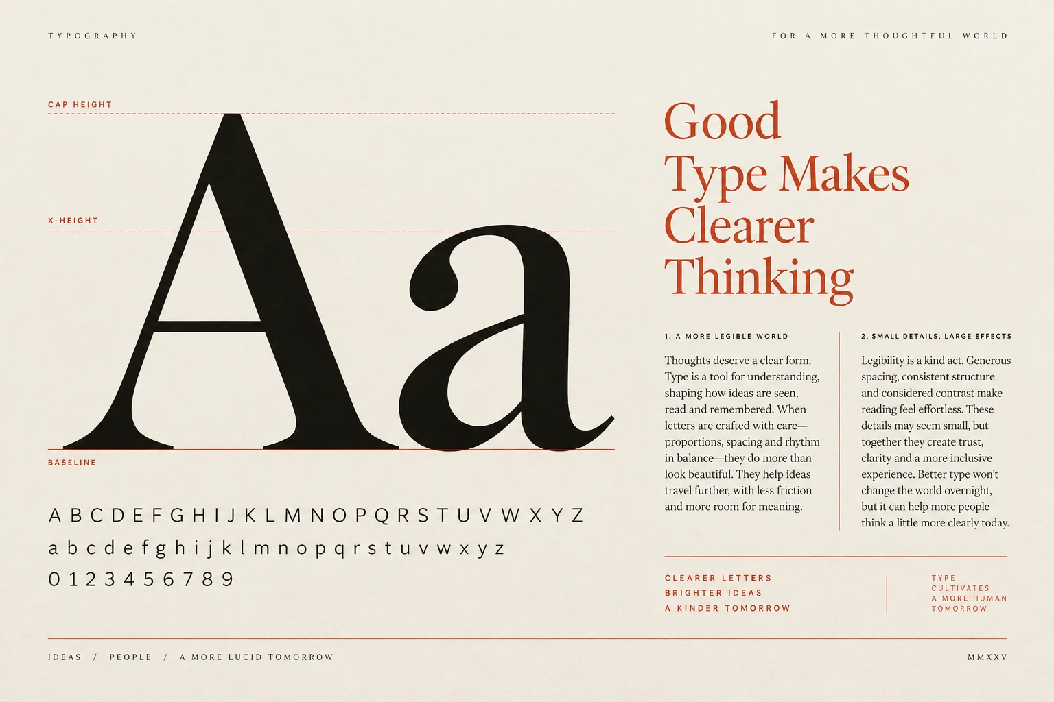
- A small extension of a rounded or pointed form beyond a flat alignment line.
In practice
- Start with shared alignment guides
- Review visible shapes at their final size
- Document recurring optical corrections
Avoid
- Applying one tracking value to every size
- Making large corrections without comparing the original
- Changing a font's built-in letterforms to solve a layout issue
The test
Compare the original and adjusted versions at their intended sizes. Does the correction make the alignment clearer without disturbing neighbouring elements?
Sources
- Jan TschicholdThe Form of the Book
- Robert BringhurstThe Elements of Typographic Style
Learn this
- TypographyLetter Spacing
- TypographyOptical Alignment
- TypographyIcons
- TypographyFont Smoothing
- LayoutNested Border Radius
- LayoutSquircles
- DataCurve Smoothing
- IdentityOptical Masthead
Reviewed against all forty, on your product.
The audit is the cheapest thing we sell, and it regularly concludes that you do not need the project you came for.