
Colour · 01 of 04
Establish structure before colour
Use spacing, alignment and emphasis to build a layout that colour can support.
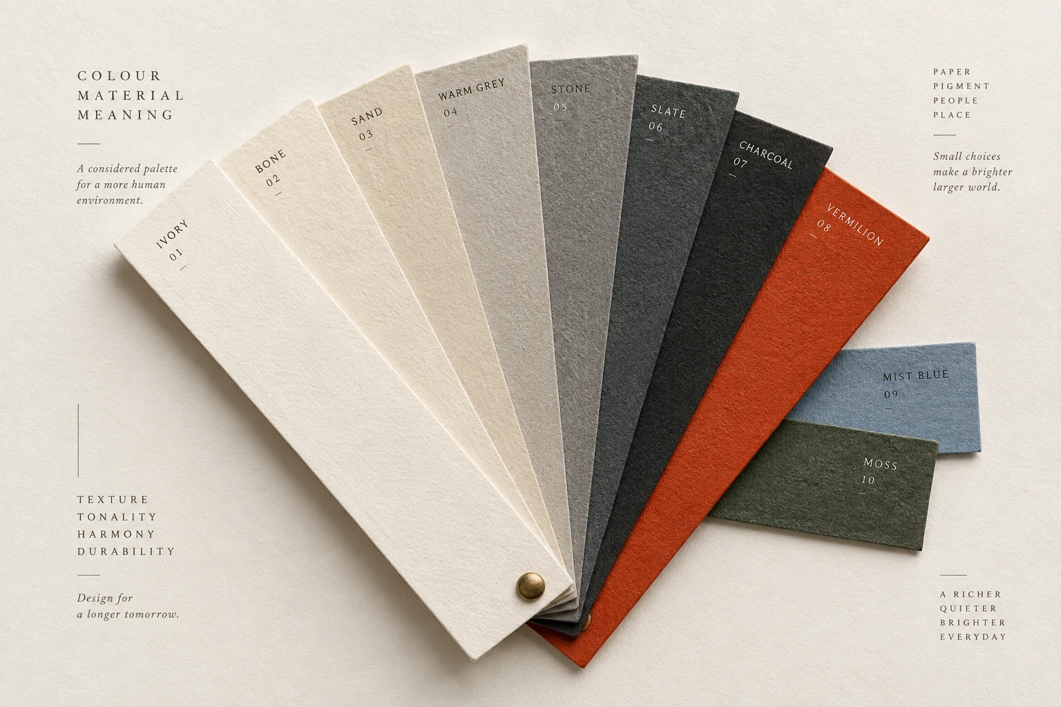
The idea
Working in neutral colours can expose problems that a vivid palette temporarily hides.
If a label seems disconnected from its field, or two sections run together, address the spacing and hierarchy before adding another coloured surface.
Then introduce colour for the roles it needs to serve: identity, emphasis, grouping or status. Name reusable colours by their purpose, such as body text or raised surface. A greyscale review is a useful diagnostic, not proof that every colourful design is wrong. Check the final palette in the actual layout.
How to see it
Terms used in this lesson
The parts
- Neutral palette
- A set of restrained colours used for the main surfaces and text.
- Colour role
- The purpose of a colour, such as body text or selected state.
- Grouping
- The way related content is presented as a unit.
In practice
- Establish grouping with spacing and alignment
- Name colours by their role
- Review the final palette in context
Avoid
- Adding colour to conceal unclear grouping
- Creating unused colour variants
- Treating greyscale as a complete accessibility test
The test
Temporarily view the page in greyscale. Which relationships become unclear, and could a label, spacing change or stronger shape preserve them?
Use the Contrast Grid to check the text and surface combinations in your neutral palette before introducing accents.
Sources
- Johannes IttenThe Art of Color 1961
- Josef AlbersInteraction of Color 1963
- W3CWCAG 2.2 Success Criterion 1.4.1 Use of Color 2023
Reviewed against all forty, on your product.
The audit is the cheapest thing we sell, and it regularly concludes that you do not need the project you came for.