
Fluid Typography with CSS: A Practical Guide
Build a fluid type system with copyable CSS, calculated font sizes and practical zoom checks. Learn when fixed rem sizes are the better choice.
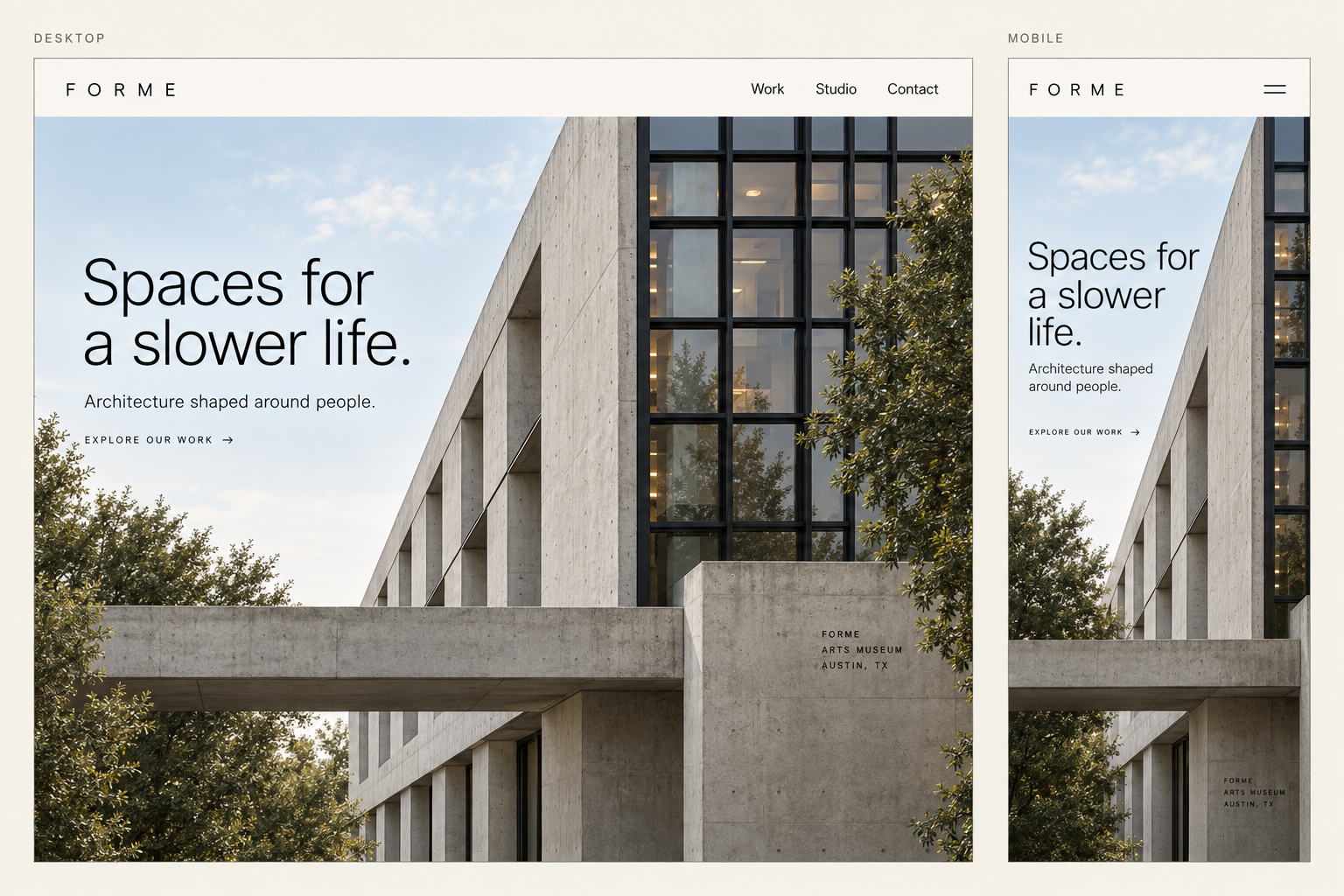
Use clamp() to let a heading grow between two sizes, keep reading text in relative units, and test the result with real content and browser zoom. A fluid type system should preserve the distinction between a page title, a section heading and a paragraph as the available space changes.
This guide builds a small system for an editorial page: a title that grows from 32 to 48 pixels, section headings from 24 to 32 pixels, and body text that stays at 1rem. Those pixel equivalents assume a 16-pixel root font size. They are starting values for this example, not a prescribed scale for every website.
You will get the calculation, copyable CSS and a testing procedure. You will also see why a valid clamp() expression can still fail a reader who enlarges the page.
Try the live code preview to compare mobile, tablet and desktop widths, then download the HTML and CSS.
Choose text roles before choosing a ratio
A scale tells you which sizes are available. A hierarchy tells you what those sizes mean. Begin with four roles: page title, section heading, body and supporting label. Put a real headline, your longest likely section heading and a full paragraph into the layout before adjusting numbers.
For an article, the paragraph deserves attention first. If it feels cramped, increasing the title will not solve the reading problem. Choose the body size, line-height and column width together, then establish enough separation for the headings to be easy to scan.
The Type Scale tool helps you explore proportions and export CSS. Treat its output as a set of candidates. A ratio that looks elegant in a specimen may make a long product title overwhelm a narrow card. Our typography principles explain the related decisions about hierarchy, measure and spacing.
In this implementation, only the two heading roles grow with the viewport. The body and label remain in rem. Fixed relative sizes are a valid design choice; every text style does not need to move when the window changes.
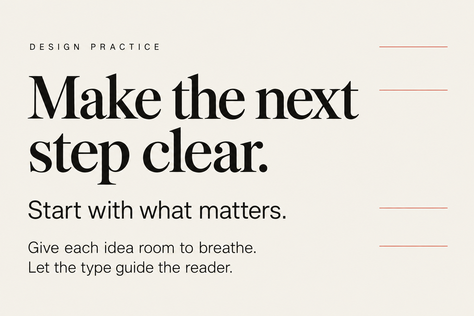
Four roles, one reading order: label, headline, subheading and body. This specimen illustrates hierarchy; the live example below shows the actual CSS output.
Calculate a fluid font size from two endpoints
The syntax is clamp(minimum, preferred, maximum). The browser uses the preferred value while it sits within the bounds, and uses the appropriate bound outside that range. See MDN's clamp reference for the function's behaviour.
For our section heading, choose 24 pixels at a viewport width of 360 pixels and 32 pixels at 1,280 pixels. We want a straight-line increase between them. The calculation is:
size change = 32 - 24 = 8px
width change = 1280 - 360 = 920px
slope = 8 / 920 = 0.00869565
vw coefficient = slope × 100 = 0.869565
intercept = 24 - (slope × 360) = 20.869565px
intercept in rem = 20.869565 / 16 = 1.304348rem
That produces:
.section-heading {
  font-size: clamp(1.5rem, 1.30435rem + 0.86957vw, 2rem);
}
The viewport term supplies the growth. The rem term contributes a size relative to the root element. As MDN explains font sizing, rem refers to the root font size rather than the nearest parent.
At a 16-pixel root, the rounded expression gives these values:
Viewport width | Section heading | What is happening |
|---|---|---|
320px | 24px | Held at the minimum |
360px | About 24px | Start of the fluid range |
768px | About 27.55px | Growing between the bounds |
1,280px | 32px | Reaches the maximum |
1,600px | 32px | Held at the maximum |
The endpoint widths depend on the assumed root size. If the reader changes their default font size, the rem values change while vw continues to follow the viewport. The sizes and transition widths will therefore change too. Preserve that flexibility; do not force a 16-pixel root to keep the table exact.
Implement a small, reusable type system
See the type respond.
This runs the HTML and CSS shown below. Change the viewport width or the root font size to see how the text responds.
Preview shown at 91% to fit this page. Sizes above are the computed CSS sizes. Root-size changes simulate a font preference, not browser zoom.
Give each size a role-based token. This lets a later correction update every section heading, instead of leaving slightly different values across components. Here is the full starting CSS:
:root {
  --text-body: 1rem;
  --text-label: 0.875rem;
  --text-section: clamp(1.5rem, 1.30435rem + 0.86957vw, 2rem);
  --text-title: clamp(2rem, 1.60870rem + 1.73913vw, 3rem);
}

* {
  box-sizing: border-box;
}

body {
  margin: 0;
  font-family: system-ui, sans-serif;
  font-size: var(--text-body);
  line-height: 1.6;
}

.article {
  max-inline-size: 65ch;
  margin-inline: auto;
  padding: 2rem 1.25rem;
  overflow-wrap: anywhere;
}

.article__title {
  margin: 0 0 1.5rem;
  font-size: var(--text-title);
  line-height: 1.15;
  letter-spacing: -0.02em;
}

.article__heading {
  margin: 2.5rem 0 1rem;
  font-size: var(--text-section);
  line-height: 1.25;
}

.article__label {
  margin: 0 0 0.75rem;
  font-size: var(--text-label);
  font-weight: 600;
}

.article p {
  margin-block-start: 0;
  margin-block-end: 1.25rem;
}
Pair it with semantic HTML and a viewport declaration:
<!doctype html>
<html lang="en">
<head>
  <meta charset="utf-8">
  <meta name="viewport" content="width=device-width, initial-scale=1">
  <title>A type system that survives real content</title>
  <link rel="stylesheet" href="styles.css">
</head>
<body>
  <main class="article">
    <p class="article__label">Design practice</p>
    <h1 class="article__title">A type system that survives real content</h1>
    <p>Start with the paragraph. Give the reader enough room to follow
      the argument, then establish a clear hierarchy around it.</p>
    <h2 class="article__heading">Make the next section easy to find</h2>
    <p>A heading marks a change in the argument. Its size and spacing
      should make that change visible without interrupting reading.</p>
  </main>
</body>
</html>
Save the CSS as styles.css beside the HTML file and open the HTML in a browser. Resize the window to inspect the transition. The title uses the same calculation as the section heading, with a 32-to-48-pixel range.
The 65ch column is a starting measure, not a promise of exactly 65 characters on every line. The unit follows a font metric, and actual line breaks depend on the words and typeface. Likewise, the body line-height of 1.6 needs a visual check in your chosen font. Replace the sample with your own copy before approving either value.
Keep heading levels tied to document structure. If a card needs to look smaller, change its class or token; do not choose an h4 merely because its default appearance is convenient. Avoid fixed heights on text containers so a longer heading can wrap naturally.
Test zoom: rem plus vw is not an accessibility guarantee
Mixing relative and viewport units does not prove that text will enlarge sufficiently. Desktop page zoom commonly reduces the layout viewport width. That can shrink the viewport-driven part of a fluid font size while the page is being magnified.
Consider our title at a 1,280-CSS-pixel viewport and a 16-pixel root. It starts at 48 pixels. If 200% page zoom reduces the layout viewport to 640 CSS pixels, the expression computes to about 36.87 CSS pixels. Magnifying that by two gives about 73.74 pixels, roughly 154% of the original title size rather than 200%. This is a calculation for those conditions, not a report of testing every browser.
That is why checking only for clipping is insufficient. WCAG's Resize Text guidance describes enlarging text to 200% without losing content or functionality, with exceptions for captions and images of text. Test whether readers can reach the enlargement they need, as well as whether the layout survives it.
For a page where the fluid headings do not satisfy your resize testing, a straightforward alternative is to replace those tokens with fixed relative sizes:
:root {
  --text-section: 1.75rem;
  --text-title: 2.5rem;
}
The rest of the system still works. You retain consistent roles, readable spacing and a constrained reading column without making font size depend on viewport width. This simpler option is often sufficient for a documentation page or text-heavy product screen.
Run these checks on the implementation you intend to ship:
Enlarge text. Check page zoom and, where available, text-only zoom. Watch the actual heading enlargement, labels, controls and any clipped text. Do not disable user zoom.
Change the default font size. Increase the browser's preferred font size and reload. Confirm the page respects it and that headings, paragraphs and controls remain usable.
Check narrow reflow. Inspect a width equivalent to 320 CSS pixels. Ordinary article content should remain readable without sideways page scrolling. W3C's Reflow guidance explains the requirement and exceptions for content that needs a two-dimensional layout.
Use difficult content. Try a long headline, a long link and the longest translated label you support. Fix the container or wrapping rules before reducing the text size to conceal the failure.
These checks cover the typography decisions in this example. They are not a complete accessibility audit of the page.
Fix the cause when the typography feels wrong
If a title wraps onto too many lines, check its available width, wording and letter spacing before making the whole scale smaller. A title that works only with a forced line break is fragile when the copy or font changes.
If a heading looks too large inside a card on a wide screen, remember what the formula measures: the viewport, not the card. A three-column grid can place a narrow card inside a large viewport. Give that component a smaller fixed rem token instead of applying the article's title formula everywhere.
If the page changes noticeably when the web font loads, inspect the fallback typeface as well as the final one. Different letter widths can change wrapping even when the computed font size is identical. Test with the final font loaded and with a slow connection; a clean first screenshot does not establish that the transition is stable.
If body text feels dense, adjust the reading column and line-height together. Increasing font size without revisiting measure can leave the same paragraph with awkwardly short lines. Make one change at a time, read a full paragraph, then compare the result at a narrow and wide width.
Ship the system you have tested
Keep the approved tokens in one place and record the sample content, font and widths used to review them. Recheck those examples when the brand typeface changes or a new component adopts the tokens. That small record makes a future revision easier to judge than a page of unexplained numbers.
Start with the CSS above or explore alternatives in the Type Scale tool. Choose the version that makes real content comfortable to read and survives enlargement. A successful type system is one the reader can use across the conditions your design encounters.