Liquid Glass on the web: a practical readability review
Review glass effects against real backgrounds, text contrast, motion and solid fallbacks. A practical guide to readable translucent web interfaces.
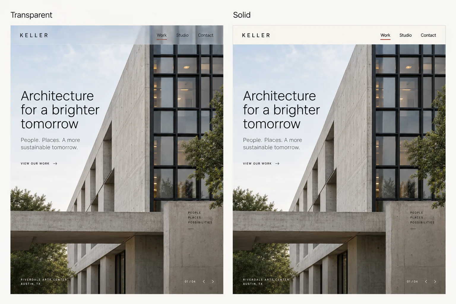
A translucent toolbar can look beautiful over a quiet photograph and become difficult to read a few scrolls later. The CSS has not changed. The content behind it has.
The review therefore has to include the backgrounds behind the controls, including content you do not choose yourself.
Apple’s WWDC26 platform presentation describes refinements to Liquid Glass, including how it diffuses complex content and defines its edges. Those refinements address a central challenge: keeping controls legible as their surroundings change.
On a website, copying the appearance with blur and a translucent fill does not reproduce the native material. Before you adopt the effect, decide where it helps people understand the interface and how it will behave when the background stops cooperating.
Decide what the glass is doing
There is a plausible reason to use a translucent surface for a small navigation bar: it can keep controls visually separate while retaining a sense of the page beneath. That does not make it a good container for every kind of content.
A paragraph asks someone to sustain attention. A form asks them to distinguish labels, values, help text and errors. A dense table asks them to follow rows. Putting all three on a changing background creates extra conditions to manage, often without giving the reader anything useful in return.
For a hypothetical portfolio, consider a compact project-navigation bar that floats over case-study imagery. Glass might preserve the feeling of the work continuing beneath it. Keep the case-study text on a stable surface, however, so the visitor does not have to negotiate the image to read the explanation.
A useful decision rule: name the information the transparency preserves. If the answer is only “it looks current,” try a solid surface first and compare the two in context.
Separate native Liquid Glass from a CSS effect
Apple’s Liquid Glass overview describes a material integrated into its platform frameworks. On the web, a combination of blur, borders and transparency is your own implementation with your own responsibilities.
Treat the web version as an inspired visual treatment. Do not assume it inherits native adaptation, accessibility behaviour or performance characteristics.
Give the developer a brief that specifies the supported backgrounds, the controls that must remain legible, the fallback surface, and whether movement is necessary. Review those requirements against the implementation.
Build a background test sheet
Take the actual toolbar and place it over a small set of deliberately different backgrounds. Use real images from the site as well as simple stress cases. Keep the foreground unchanged so the comparison reveals the material’s behaviour.
Background | What it can expose | What to inspect |
|---|---|---|
Pale, low-detail image | A light surface loses its boundary | Labels, control outlines and focus ring |
Dark image | Dark text loses contrast | Foreground colour and selected state |
Black-and-white detail | Local contrast changes behind one word | Every label, not only a sampled average |
Saturated colour | Tint changes the surface’s apparent meaning | Status indicators and accent colours |
Text beneath the toolbar | Competing letterforms remain visible | Whether blur and fill suppress interference |
Moving or scrolling content | Readability changes during use | Stable labels through the full movement |
Run the same sheet with the longest navigation labels and at a narrow viewport. A surface that works with a short label can fail when two lines overlap a different part of the image.
Save the failing case. It is more useful in a design discussion than a general request for “a little more contrast.” It gives the team a specific condition to fix and retest.
Measure the foreground against the rendered surface
For WCAG’s minimum text-contrast criterion, ordinary text needs a ratio of at least 4.5:1 and qualifying large text needs at least 3:1. Those thresholds have defined exceptions and size conditions; use the W3C explanation when applying them.
With transparency, the declared CSS background colour is not necessarily the colour behind the text. The result depends on the image, tint, opacity and blur. Measure the composited background in the relevant states rather than comparing the text with an uncomposited token. Use the intended foreground colour; sampling an anti-aliased edge can distort the text measurement.
The studio’s contrast grid is useful for choosing candidate colour pairs. It cannot, by itself, establish that those pairs pass over every photograph or scroll position. For that, inspect the actual surface. This is why contrast is not taste: a pleasant impression does not settle a measurable requirement.
If the background can be arbitrary user content, one passing screenshot is especially weak evidence. A stronger fill or opaque label area constrains the problem. Restricting glass to regions with controlled backgrounds is another option. Choose a behaviour the product can maintain, not a treatment that depends on every future image being quiet.
Keep a solid version that looks intentional
Build the solid surface first. Establish the spacing, label hierarchy, selected state and keyboard focus treatment before introducing transparency. That surface becomes both your comparison and your fallback.
In the portfolio example, the fallback could be warm ivory with dark labels and a clear selected-project marker. It should look like a considered version of the same navigation, not like a feature failed to load.
Specify when it is used: unsupported effects, a user-selected appearance preference, or a background condition your design cannot handle reliably. Implement and test the mechanism in the actual browsers you support; do not assume a native platform preference automatically changes a custom web component.
Movement deserves a separate decision. A readable surface can still be distracting if its highlights or refraction move continuously. Start without decorative motion. If you add it, preserve the same hierarchy when it is removed and respect stillness in the alternative experience.
Watch the material adapt, then examine the criticism
Apple’s Meet Liquid Glass session introduces adaptivity at 6:00. Watch how the material responds to context. Use that behaviour as a prompt for questions about your web implementation, rather than a promise that adding blur gives you the same result.
Watch on YouTube: WWDC25: Meet Liquid Glass — Apple Developer
The following post by graphics programmer Xor discusses low contrast in the June 2025 beta. It is historical commentary on that beta, not a verdict on Apple’s 2026 implementation. Its value here is the concrete design question: what changes when the background makes the foreground difficult to distinguish?
I am a graphics programmer, and here's my feedback on Apple's Liquid Glass beta. The idea is cool, but it's difficult to work with from a UX perspective.
Let's start with the main problems:
1 - Low Contrast: It's clearly not readable, but there are many different ways to fix it. pic.twitter.com/qLNY1FYYwW— Xor (@XorDev) June 10, 2025
Make the release decision on the worst supported case
For the portfolio toolbar, review a complete scroll through a case study with the real imagery in place. Test the menu open and closed, the current-project state, keyboard focus, longer labels and the solid alternative. Repeat the review at the narrow layout.
Record the result in a small decision table:
Check | Release question |
|---|---|
Purpose | Does transparency preserve useful context? |
Legibility | Are labels readable across the supported backgrounds and states? |
Interaction | Are current, hover and focus states distinguishable? |
Fallback | Is the solid version complete and usable? |
Motion | Can the same task be completed comfortably without decorative movement? |
Performance | Does scrolling remain responsive on representative target devices? |
When one condition fails, change the smallest relevant part and rerun that case. A denser fill may solve the problem. A stronger boundary may help separate the bar but still leave its labels unreadable. More blur may suppress image detail without producing sufficient text contrast. Treat each as a different intervention with a result to check.
The effect earns its place when people can enjoy the work beneath it and use the controls above it without hesitation. If a solid surface does that better, use it. Keep the treatment that makes the actual page easier to use.
Cover: AI-generated comparison of a hypothetical portfolio interface, showing transparent and solid navigation treatments.