How to review an AI-generated interface before you ship it
A detailed AI interface workflow: explore with image generation, develop screens in Google Stitch, prototype the journey and review the working product.

You can use image generation to explore what an interface should look like, Figma or Google Stitch to develop related screens, and a coding agent to turn a selected direction into a working prototype. The useful part is the ability to make an idea concrete, compare alternatives and change course before too much implementation depends on it.
The challenge is deciding what each output has established. A generated image can make a layout persuasive. A clickable prototype can make a sequence understandable. A running application can demonstrate behaviour. Treating those as the same kind of evidence leads to both premature approval and unnecessary rework.
This guide follows a hypothetical document-sharing feature from brief to implementation. It includes prompts you can adapt, decisions to compare, and checks for the final flow. The examples are proposed design exercises, not claims about measured client outcomes.
Write the task before reviewing the screen
“Review the sharing modal” invites comments about the modal. “Help a project owner give a colleague view-only access to a document” gives the review an outcome.
Write down who is acting, what they need to accomplish, and what must remain true afterwards. For our example:
A project owner can invite a colleague to view one document. The invitation does not expose other documents or grant editing rights. The owner can see, change and revoke that access later.
This short description exposes decisions a polished mockup can conceal. Is the document already public? Does sending an invitation immediately grant access? What happens if the address belongs to someone outside the organisation? The answers depend on the product. They should be explicit before anyone approves the layout.
Bring the product owner or engineer into questions about actual permissions. Design review can identify an ambiguous promise; it cannot establish that the backend enforces it.
Review output: one agreed task statement and a short list of unresolved product rules. If those rules affect access or data loss, resolve them before treating the screen as complete.
Choose the artifact that answers your next question
AI can help you explore a visual direction, produce related screens, build a clickable journey or implement a working interface. Those outputs answer different questions. Choosing between them is part of the design work.
For the document-sharing example, an image can help compare a compact dialog with a persistent side panel. A connected prototype can reveal whether the sender understands the sequence. A running implementation can show whether failed invitations preserve input. You do not need the most complete artifact at every step; you need enough fidelity to investigate the decision in front of you.
Your unanswered question | Useful next artifact | What to compare | What it cannot establish |
|---|---|---|---|
What should this experience feel like? | Generated visual references | Density, hierarchy, typography, image treatment | Interaction or real content behaviour |
How should related screens fit together? | A screen set in Google Stitch or a design canvas | Repeated controls, consistent permissions and navigation | Whether the underlying permission model is enforced |
Will someone understand the journey? | Clickable prototype with realistic content | Discovery, sequence, labels and recovery expectations | Backend reliability or production performance |
Does the flow behave correctly? | Running implementation with controlled test data | Input handling, requests, focus, responsive layout | Whether it solves a worthwhile user problem |
Use the simplest route that resolves the uncertainty. If the team already has a clear design system and the change is an extra form field, a fresh image-generation round may add noise. If the team disagrees about the entire visual direction, jumping into code can turn that disagreement into repeated implementation work.
Use image generation to explore a direction before building it
Image generation is useful early because it makes a vague aesthetic conversation concrete. “More editorial” could mean larger serif headings, fewer controls, a warmer palette or more space around content. A visual reference lets the team point to which of those changes it means.
Ask for alternatives that differ in structure, not a collection of colour variations. For the sharing flow, explore a centred dialog, a right-hand panel and a dedicated access-management page. Keep the task, sample recipients and permissions constant. Otherwise, you may choose a concept because it contains easier content rather than because its structure is better.
Here is an example brief for an image generator. It describes a proposed workflow, not the output of a benchmark or a tested client project:
Create a flat, front-facing desktop interface concept for sharing one project document with colleagues. Show the document name, three recipients, a permission setting per recipient and one primary invitation action. Use warm ivory surfaces, near-black text and a restrained rust accent. Make the permissions easier to scan than the avatars. Explore a right-hand panel that keeps the document visible behind it. Use realistic text lengths. Do not add decorative charts, invented metrics, a device frame or floating 3D panels.
Generate another direction by changing the layout requirement to a centred dialog. Compare the two against the task: which keeps the document identity clear, which supports multiple recipients, and which leaves room to explain partial failure? A large panel may work better for managing many people but feel disproportionate for inviting one colleague. That tradeoff should drive the choice.
Turn the chosen image into decisions
Once a direction is selected, write down what to preserve. For example: keep permissions adjacent to names, put the document title above the recipient list, reserve one accent colour for the primary action, and show result messages within the same panel.
Also record what is provisional. Generated lettering, invented icons and an attractive shadow are not implementation requirements. A raster image has no semantic structure, focus order or responsive rules. Recreate labels and controls as native interface elements rather than publishing the entire image as the interface.
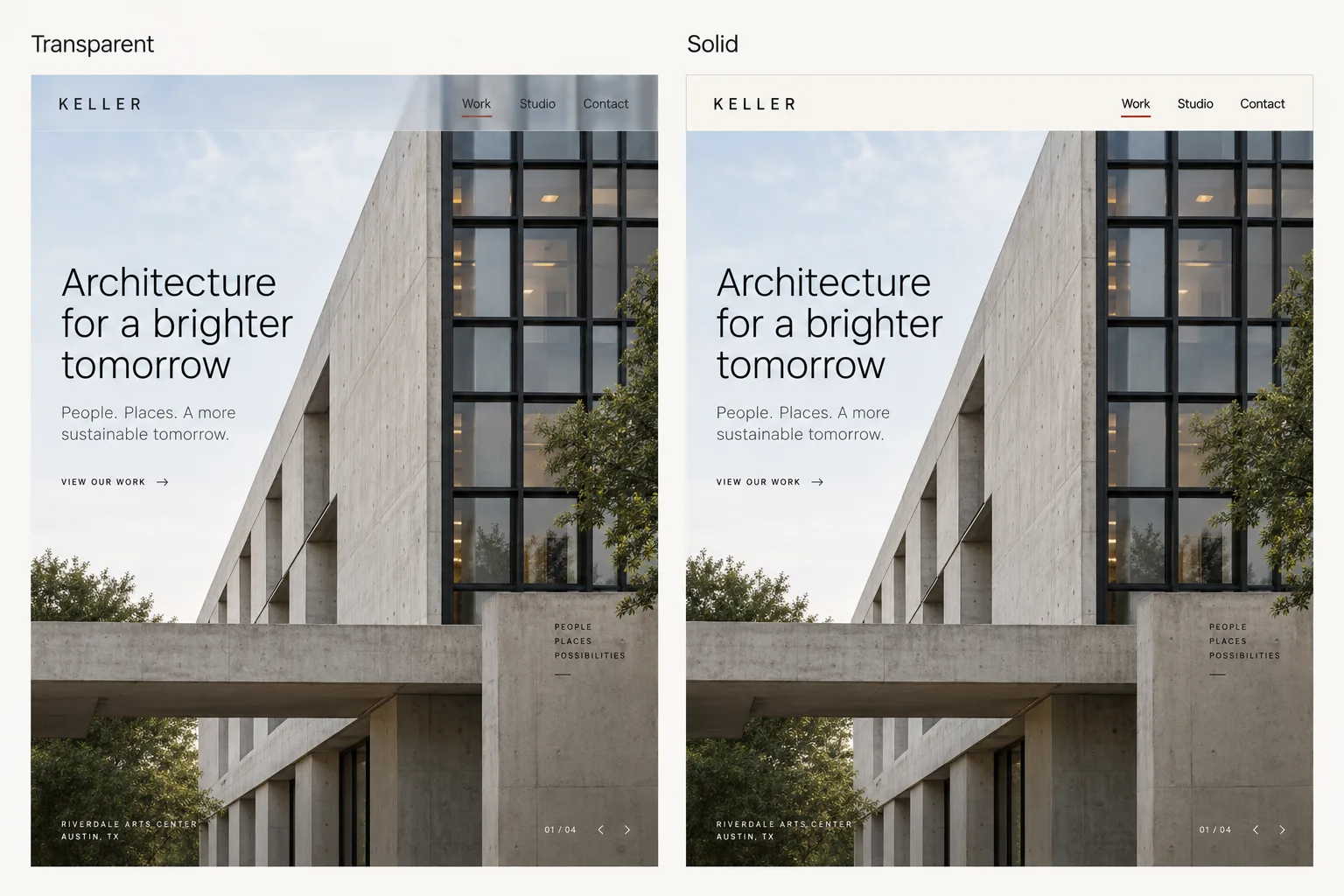
For article or product imagery, ask a separate question: what does this picture explain? A believable review scene can establish context; a side-by-side interface example can demonstrate a difference. An abstract object that merely looks expensive may contribute neither. If the picture depicts an invented product or scenario, label it as an illustration rather than presenting it as evidence of real work.
Choose between image generation, Figma and Stitch
There is no required sequence of tools. A useful route is to generate a visual reference, choose the direction, then build it in the environment where the team can edit and test it. That environment might be Figma, Stitch or the existing codebase. Moving through all three is unnecessary if one already answers the next question.
ChatGPT image generation and GPT Image 2.5: visualise the reference
Image generation in ChatGPT can be used to explore interface references before implementation. For API workflows, OpenAI documents GPT Image 2.5 for generation and editing in its image prompting guide. A generated screen is a visual proposal: use it to decide composition, hierarchy and atmosphere, then translate the selected decisions into an editable interface.
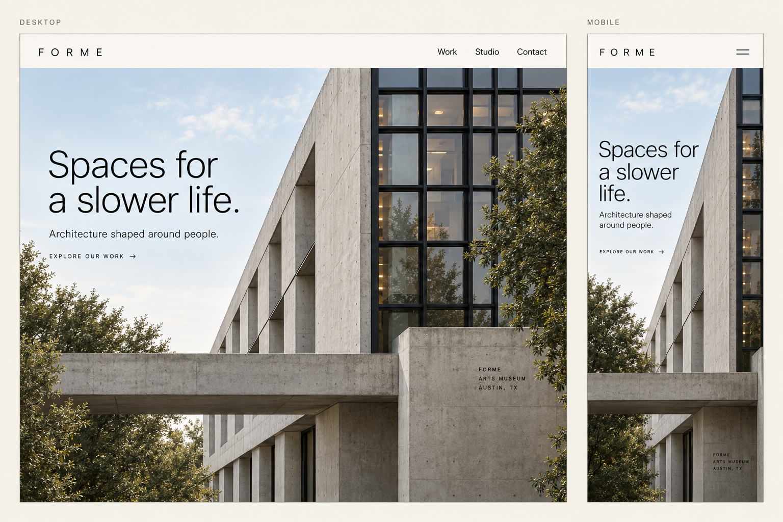
For example, a portfolio homepage might need a stronger relationship between the headline and featured work. Ask for three structural directions: an oversized project photograph with a compact introduction, an editorial split layout, and a project-led index. Keep the same copy and projects in each. Compare what a visitor understands first, rather than choosing whichever image has the most dramatic lighting.
Create a full-page, front-facing website reference for an independent architecture studio. Use the supplied headline and project names exactly. Give the featured project the strongest visual emphasis, keep navigation understated, and make the project enquiry action easy to find. Show the complete page without cropping. Use believable architectural photography and readable interface proportions. Produce one coherent direction, not a collage of floating screens.
After choosing a direction, request a targeted edit: keep the layout and imagery, reduce the headline width, and make the enquiry action clearer. Save the selected version with a short explanation of what makes it work. That explanation is what lets a designer or coding agent preserve the idea when the viewport or content changes.
The same method works with other image generators. Evaluate their output against your brief: are the words accurate, are repeated elements consistent, is the whole layout visible, and can the design survive without effects baked into a bitmap? A visually convincing reference is valuable even when it needs reconstruction. It becomes a problem only when the team mistakes visual plausibility for implemented behaviour.
Figma Design and Figma Make: turn the reference into editable work
Use Figma Design when the next task is to make deliberate component and layout decisions with the team. Place the reference beside editable frames, recreate the important hierarchy, and replace invented controls with the product’s existing components. Compare the result at both a wide and narrow viewport. Importing a picture does not turn its pixels into editable interface components.
Figma Make accepts designs and images as context for functional prototypes. This gives you another route: attach the approved reference or Figma frames, describe the task and states, and iterate on the running result. Choose this path when interaction is the next uncertainty rather than when you only need another static visual variation.
Use the attached reference for layout and the attached components for controls. Build the sharing flow with editable recipient fields and a permission selector. Include a selectable partial-failure test case. Preserve the visual hierarchy, but adapt the layout when long email addresses or a narrow viewport require more space. Explain any behaviour you cannot implement from the supplied requirements.
Stitch is an alternative for exploring and connecting screens with design context. Figma is useful when your team’s components and review work already live there. A coding agent is useful when the existing implementation is the source of truth. Pick the route that preserves context and exposes the behaviour you need to test; do not restart the design simply to move into another tool.
Use generated video to explore motion, then prototype the interaction
A still image cannot communicate how a panel enters, how focus moves through a transition, or how a result replaces a loading state. A generated motion reference can help a team discuss the intended sequence and pacing before building an animation. Its role is to communicate a proposed experience.
For the sharing panel, write a short storyboard first: the panel opens, the recipient list remains stable during submission, and the result appears beside each recipient. Keep the camera fixed and the interface legible. Ask for one transition at a time so the review can distinguish the intended movement from accidental changes to labels or controls.
Create a short motion reference from the supplied interface image. Keep the camera fixed and preserve the screen layout. Show the sharing panel opening from the right, pause so its contents can be read, then show a quiet transition from sending to a per-recipient result. Avoid decorative camera moves, changing text and animated background objects.
If the video generator cannot preserve the labels or geometry, use the clip only for broad pacing, or replace it with a manually controlled animation. Do not use a convincing video as proof that the interface responds to input. The next step is an interactive prototype in which someone can interrupt the transition, submit twice, move focus or request reduced motion.
Write down the motion decisions you want to carry forward: what starts the transition, which elements move, what remains visible and what happens if the action fails. That specification is more useful to implementation than a clip alone. The final behaviour should still make sense with animation removed.
Use Google Stitch to develop the screen system
Google describes Stitch’s design canvas as accepting images, text and code as context and supporting connected interactive prototypes. That makes it relevant between choosing a visual direction and evaluating a journey across screens.
Bring the selected visual reference together with the written decisions. Ask Stitch to develop a small coherent flow, rather than repeatedly asking for unrelated polished screens. For our example, start with the document, the sharing panel, a result state and the access-management view.
Use this reference for visual hierarchy and spacing, not for its exact wording. Design a document-sharing flow for a project owner. Default new invitations to view-only access. Show the document name throughout. Include an invitation result with two successful recipients and one failed recipient, and a way to retry only the failed invitation. Keep component shapes, labels and spacing consistent across the screens. Explain any product rules you need me to decide instead of silently inventing them.
The final sentence matters. If your brief does not define external invitations, the tool may still produce an external-recipient warning. That can be a useful suggestion, but the team needs to decide whether the product supports the behaviour. Distinguish a generated proposal from an agreed requirement.
Change one decision at a time
Avoid a follow-up such as “make it premium and easier to use.” Name the defect and preserve everything that already works:
Keep the existing layout and type scale. The permission selector is too far from each recipient’s name. Move it into the same row, keep long email addresses readable, and show how the row adapts on a narrow screen. Do not alter the permission options.
This gives the next version a question to answer. Check the requested change, then inspect nearby consequences: did the longer row push the action out of view, did a label disappear, or did the generator change the default permission while rearranging the content?
For repeated work, keep a short design-rules document alongside the reference. Google’s DESIGN.md specification announcement describes a way to move design rules between tools. Your own rules should explain purpose as well as appearance: the accent identifies the main action; errors include text; permission choices stay beside the person they affect. A file containing only hex codes leaves those decisions unstated.
Prototype the decision, not every possible screen
A clickable prototype should help you learn something specific. For the sharing flow, the first question might be whether someone understands that “Invite” grants view-only access. The prototype needs enough surrounding context to make that decision meaningful: a document, a recipient, a permission control and a result. It does not need a complete settings area or an animated onboarding sequence.
Write the scenario before showing the prototype:
You are sending a project document to a colleague who should be able to read it but not change it. Show how you would do that, then explain what access they now have.
Avoid telling the participant which control to click. Watch where they look, what they expect and what they believe happened. If they finish the sequence but think they sent an attachment instead of granting ongoing access, the click path succeeded while the explanation failed.
In a second pass, introduce the partial-failure state. Ask what they would do next. Does the result make it clear that two invitations succeeded? Does “Retry” appear to resend all three? The aim is to reveal misunderstandings while the design is still inexpensive to change.
Keep a short record with three columns: observed behaviour, possible explanation and next change. “Paused before Invite” is an observation. “Did not trust the permissions” is a hypothesis unless the participant says so. This prevents a team from turning one ambiguous moment into an overconfident redesign.
Move to a running prototype when behaviour becomes the question
A connected screen prototype is useful for sequence and comprehension. Use a running prototype when you need to investigate typing, keyboard focus, scrolling, resizing, loading delays or state persistence. Do not make someone click a static screenshot and then infer that the form itself is usable.
Google’s May 2026 Stitch update describes sharing through AI Studio and exporting into development workflows. The ability to export is a starting point for implementation. The team still needs to decide which data is simulated, which actions are connected and what must happen when a request fails.
For a first coded prototype, use controlled sample data and a visible way to simulate success, failure and delay. That makes the design review repeatable. A demo that depends on a live service failing at the right moment is much harder to evaluate.
Carry the design decisions into implementation
When asking a coding agent to build the selected direction, provide the image, the written rules and the state requirements together. A screenshot communicates composition. The accompanying brief explains what must remain true when the composition changes.
For example:
Implement the approved sharing panel in the existing app. Reuse its dialog, button and form components. Keep the document name, recipient identity and permission visible before submission. Render all copy as text. Preserve failed recipients after a partial result and retry only those recipients. Support keyboard entry and return focus to the sharing trigger when the panel closes. Use test fixtures for the three result states until the real API contract is agreed. List unresolved assumptions.
Do not accept the desktop screenshot as the entire handoff. Include the narrow layout, the longest expected labels, empty and error states, and the rules for closing the panel. Where the existing component library already handles behaviour, use that behaviour deliberately rather than replacing it to match a generated image more closely.
Review the first implementation against both sources. Does it preserve the intended hierarchy? Does it obey the permission and recovery rules? If these conflict, resolve the conflict explicitly. A beautiful reference may need to change because a long recipient list requires scrolling or a status message needs more room.
AI is valuable here when it helps you compare options, expose missing states and implement a chosen direction. It becomes expensive when every prompt reopens decisions the team already made. Keep the selected reference, the rules and a brief decision log together so the next iteration starts from the same understanding.
Review the states around the happy path
A generated demo often makes the intended sequence easy to demonstrate. Your next job is to leave that sequence deliberately.
Start before the first click and continue after the success message. The principle state is the design is a useful reminder that a screen’s identity includes what it is doing, not only how it is arranged.
Moment | Question to test | Evidence to capture |
|---|---|---|
Before input | Is the document and current access level clear? | Initial view with realistic document data |
Invalid address | Does the message explain how to correct it? | Error beside the relevant field |
Sending | Can repeated clicks create duplicate invitations? | Behaviour during a slow response |
Failed request | Is the address preserved and retry available? | Failure followed by successful retry |
Existing access | Does inviting the same person change permissions? | Actual product behaviour and explanation |
Success | Does the confirmation name the recipient and access level? | Confirmation and updated access list |
Later | Can the owner revoke the same permission? | The complete return journey |
Do not tick a state off because a frame exists in the design file. Exercise it in the implementation where possible. A disabled-looking button can still submit, and a reassuring message can appear before the operation has succeeded.
If the prototype cannot simulate a failure, record that limitation. It is better to name an untested state than to turn a walkthrough into a false sign-off.
Replace the sample content with awkward content
Try a long document title, several recipients with similar names, and an address that nearly matches an existing colleague. Open the flow on a narrow screen with the on-screen keyboard visible.
These are small substitutions with useful consequences. A long title may push the access setting below the fold. Similar names may make an avatar-only recipient list unsafe. A narrow viewport may leave the error message visible but hide the action needed to recover.
For this example, the screen should help the sender answer three questions before submitting:
Which document am I sharing?
Who will receive access?
What will they be allowed to do?
Give those answers more emphasis than decorative summaries or a large empty illustration. Apply hierarchy through contrast: the important relationship is between information and decision, not only between large and small type.
Check the journey without a pointer
Work through the invitation using a keyboard. Can you reach the trigger, enter the modal, move through its controls, submit and return to the page without losing your place? Is the focused element visible throughout?
Then inspect the semantics with the assistive technologies relevant to your audience. A field that looks labelled may have no accessible name. An error may be visible but never announced. A modal may leave keyboard users interacting with the page behind it.
The site’s keyboard-complete principle gives this review a clear standard: the task must remain achievable without relying on a mouse. Automated checks can help find defects, but they do not replace walking through the task and interpreting what the interface communicates.
At 200% browser zoom, also check that the action and its context remain available without overlapping controls. Record the environment alongside each finding. “Focus disappears after closing the dialog in this browser” is actionable. “Accessibility needs improvement” is not.
Make recovery part of the design
Suppose the invitation fails after the sender has entered three addresses. Clearing the form makes them repeat work. Leaving the values in place without explaining whether any invitation succeeded creates a different problem: they may resend to everyone.
The right recovery depends on how the operation works. If invitations are sent independently, show which succeeded and which can be retried. If the whole operation is atomic, explain that none were sent. The interface must tell the truth about the system.
Use never lose work as a review question, not merely a reassuring phrase. Check whether input survives a failed request, whether a retry is safe, and whether leaving the screen abandons unfinished work.
For risky changes, review reversal as carefully as completion. A confirmation that says “Access updated” is weaker than one that names the person and permission. After an accidental change, the owner should be able to find and correct that permission without reconstructing the original sequence.
Understand the tooling shift, then review the result
Figma’s March 2026 announcement describes agents designing directly on its canvas. The same distinction applies to this workflow: a tool can create the screens while the team remains responsible for the product rules.
Now you can use AI agents to design directly on the Figma canvas, with our new use_figma MCP tool and skills to teach them. Open beta starts today. pic.twitter.com/AQZsFWvvXQ
— Figma (@figma) March 24, 2026
For wider context, watch Figma’s Config 2026 keynote. Treat the presentation as the company’s view of its tools and direction. Use the creation and review steps above to evaluate the work you produce with those tools.
Watch on YouTube: Config 2026 Keynote with Dylan Field — Figma
End with evidence and named decisions
A useful review produces a short record that another person can act on. For each finding, capture the trigger, the observed behaviour, the consequence and the owner of the next decision.
For example:
Trigger: submit three invitations when one request fails. Observed: the form clears and shows a general error. Consequence: the sender cannot tell who received access. Next decision: engineering confirms partial-success behaviour; design provides a per-recipient result and retry action.
Separate verified fixes from assumptions. “The engineer says the request is safe to retry” is a dependency to confirm in implementation. “We retried the failed request and no duplicate invitation was created” is an observation, bounded by that test.
Before approving the flow, check that:
The main task and permission rules are agreed.
Success, failure and return journeys have been exercised.
Realistic content works on the supported narrow layout.
Keyboard and assistive-technology findings are resolved or explicitly owned.
Recovery preserves useful input and explains the actual outcome.
Remaining gaps have an owner and a release decision.
This review is not a security assessment or a substitute for research with users. Use it alongside those activities to find gaps that a successful demo can hide.
Start with the uncertainty your team needs to resolve. Generate a visual direction when appearance is the question, connect screens when sequence is the question, and implement the flow when behaviour is the question. Keep the decisions that survive those steps, then test the complete task before releasing it.
Cover: AI-generated illustration of a hypothetical interface review.