
01
Empty
No signals in this view
Select a site
A first impression, not a blank panel. It says what belongs here and waits.
Six teams, four visual languages, one product. We rebuilt the token architecture underneath and let the interface converge on its own.
The brief
214 distinct colour values in production. The ask was a redesign. The actual problem was that no two teams could agree on what anything was called.
Meridian had shipped fast for three years and had the interface to prove it: 214 distinct colour values in production, eleven button variants, and three separate date pickers. The ask was a redesign. The actual problem was that no two teams could agree on what anything was called.
Fig. 02
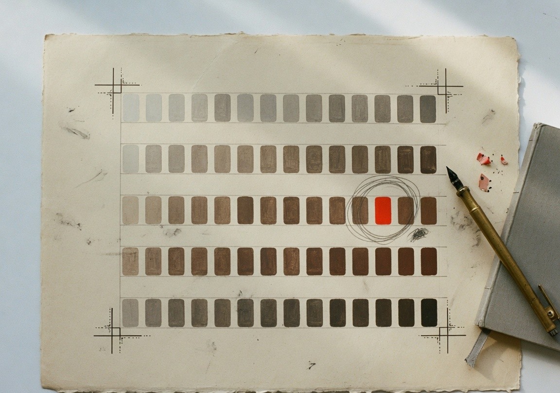
Every colour in production, counted. Then the thirty-one that remained after the system had names.
The approach
We started with an inventory rather than a design. Every colour, spacing value, type style and component variant in production, counted and mapped to where it was used. The number made the case for us. Nobody argues with 214.
The token architecture came before any visual work: primitive values, semantic roles, component-level overrides. Getting the naming right at this layer meant every downstream decision inherited a correct structure instead of a compromise.
Components were rebuilt with their full state matrix specified up front: empty, loading, partial, error, overflow, with accessibility built in rather than documented alongside. Migration ran team by team, with office hours every week, over two quarters.
Fig. 03
The visual work started after this sheet existed. If a later screen needed a new colour, the question was which role it was, not which hex.
01 Primitive
Raw values. No meaning yet. Paper, ink, the few hues the product is allowed.
02 Semantic
Roles. Danger, ok, info, text, surface. A colour is used because of what it means.
03 Component
Overrides at the edge. A button may darken. A chart line may be the accent. Nothing new is invented here.
Fig. 04
One chassis, five states. The signal row was specified in this order, before a populated mock went to engineering. Empty and error were drawn first, because that is where people actually arrive.
Signal row · v2
Id, reading, spark, status. Same slots in every state.
01
No signals in this view
Select a site
A first impression, not a blank panel. It says what belongs here and waits.
02
The chassis holds. Bars sit where the id, the reading and the status will land.
03
Level has arrived. Rate has not. The row tells the truth instead of inventing a zero.
04
The collector is down. Colour is not the only signal. The words would still work in grey.
05
A name the layout never budgeted for. Truncate, count the rest, do not wrap the row apart.
This was the first component pull request. The rest of the system is that decision, repeated, team by team, for two quarters. The numbers that follow are what it looked like in production.
The outcome
214→31
Colour values in production
The unnamed field in Fig. 02, reduced to roles six teams could share without a meeting.
-41%
Time to ship a new screen
Review stopped being a colour negotiation. The token sheet answered it.
AA
WCAG 2.2, all core flows
Contrast lived in the token, not in a ticket. Markup meant the thing it looked like.
94%
Adoption after two quarters
Office hours, not a mandate. The names were usable, so the library was used.
Held to
Three laws from the canon, applied on this job rather than cited after it.
01
The instrument was rebuilt in ink and paper. Vermilion entered last, and only as named roles: danger, series, the flow line. It is not a theme laid over a layout that needed it to make sense.
Read the law →02
Fig. 04 is the first component that shipped. Empty, loading, partial, error and overflow were in the pull request. The populated row was drawn last, which is the order the product is actually used.
Read the law →03
Status is a word, not only a colour. Rows are a table. Buttons are buttons. The AA result is what happens when the markup describes the content and the tokens carry the contrast.
Read the law →Next project
We filmed the product on paper tape
Halden · 2026
Something similar in front of you?
Describe the problem rather than the solution. We reply within two working days and will tell you honestly whether this is work we should take.