
Access · 01 of 04
Use elements that match their purpose
Build the meaning and behaviour of the page before refining its appearance.
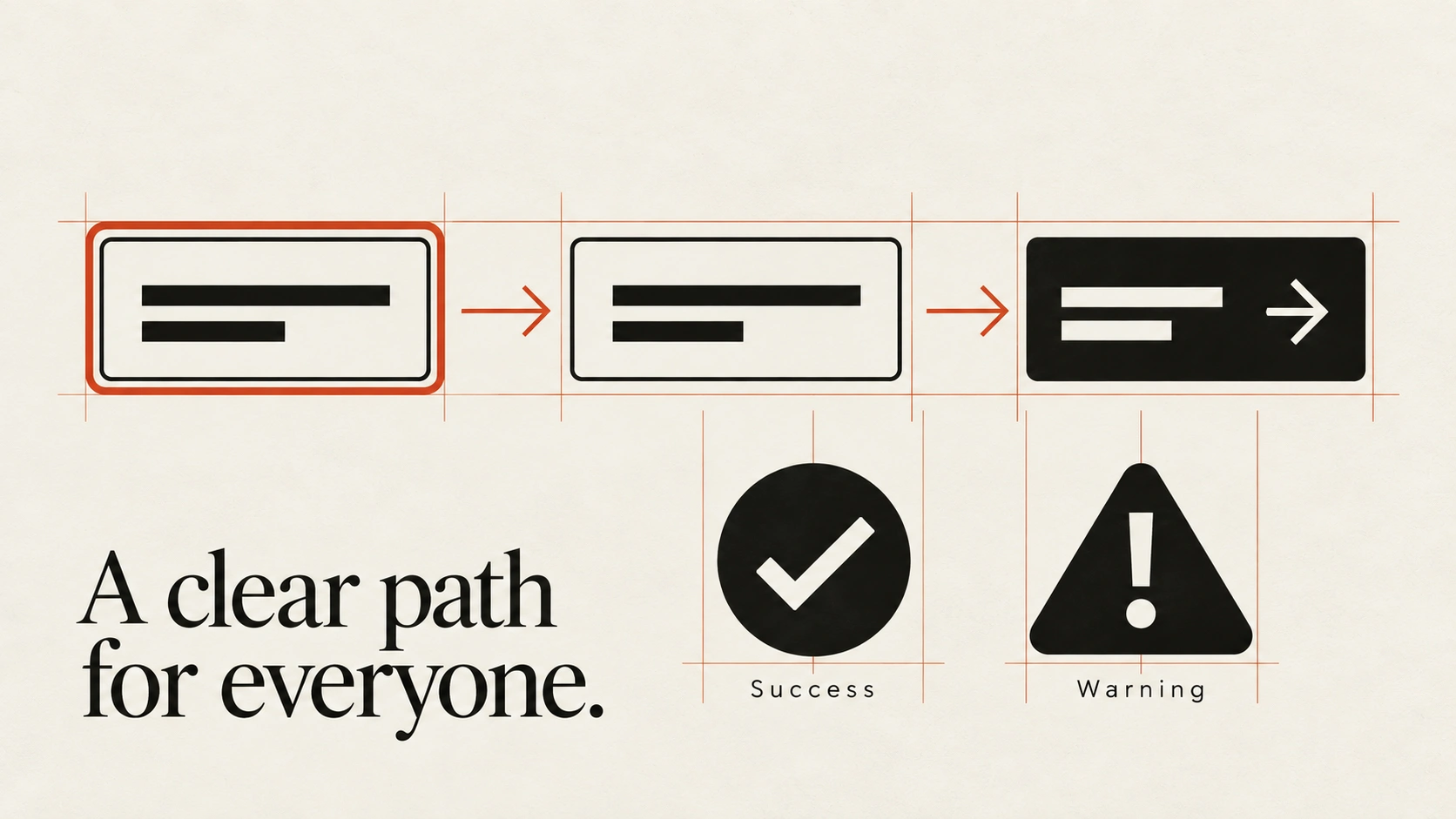
The idea
Choose native controls where they meet the task.
Use a button for an action and a link with a destination for navigation. Their built-in semantics and behaviour reduce the amount of keyboard and assistive-technology support you need to recreate.
Structure the document with meaningful headings, lists and landmarks. Give form fields persistent labels and associate helpful instructions with their controls. Custom widgets sometimes need additional behaviour and ARIA, but an accessible name alone does not make a widget complete. Check its keyboard interaction and state announcements too.
How to see it
Terms used in this lesson
The parts
- Semantics
- The meaning conveyed by an element's role and structure.
- Accessible name
- The name assistive technology uses to identify a control.
- Native control
- A built-in HTML control with established browser behaviour.
In practice
- Use native elements where appropriate
- Give controls meaningful labels
- Test custom behaviour with a keyboard
Avoid
- Choosing heading levels for visual size
- Click handlers on otherwise inert elements
- Assuming an ARIA role supplies keyboard behaviour
The test
Inspect the page outline and complete the main task with a keyboard and screen reader. Do the names, roles and states describe the interface accurately?
Learn this
- ProductSemantic Row
- ProductFocus Appearance
Reviewed against all forty, on your product.
The audit is the cheapest thing we sell, and it regularly concludes that you do not need the project you came for.