
09 / Inclusion

Access

Make the experience usable through different ways of seeing and interacting. Start with meaningful structure, support keyboard use and test with assistive technology.

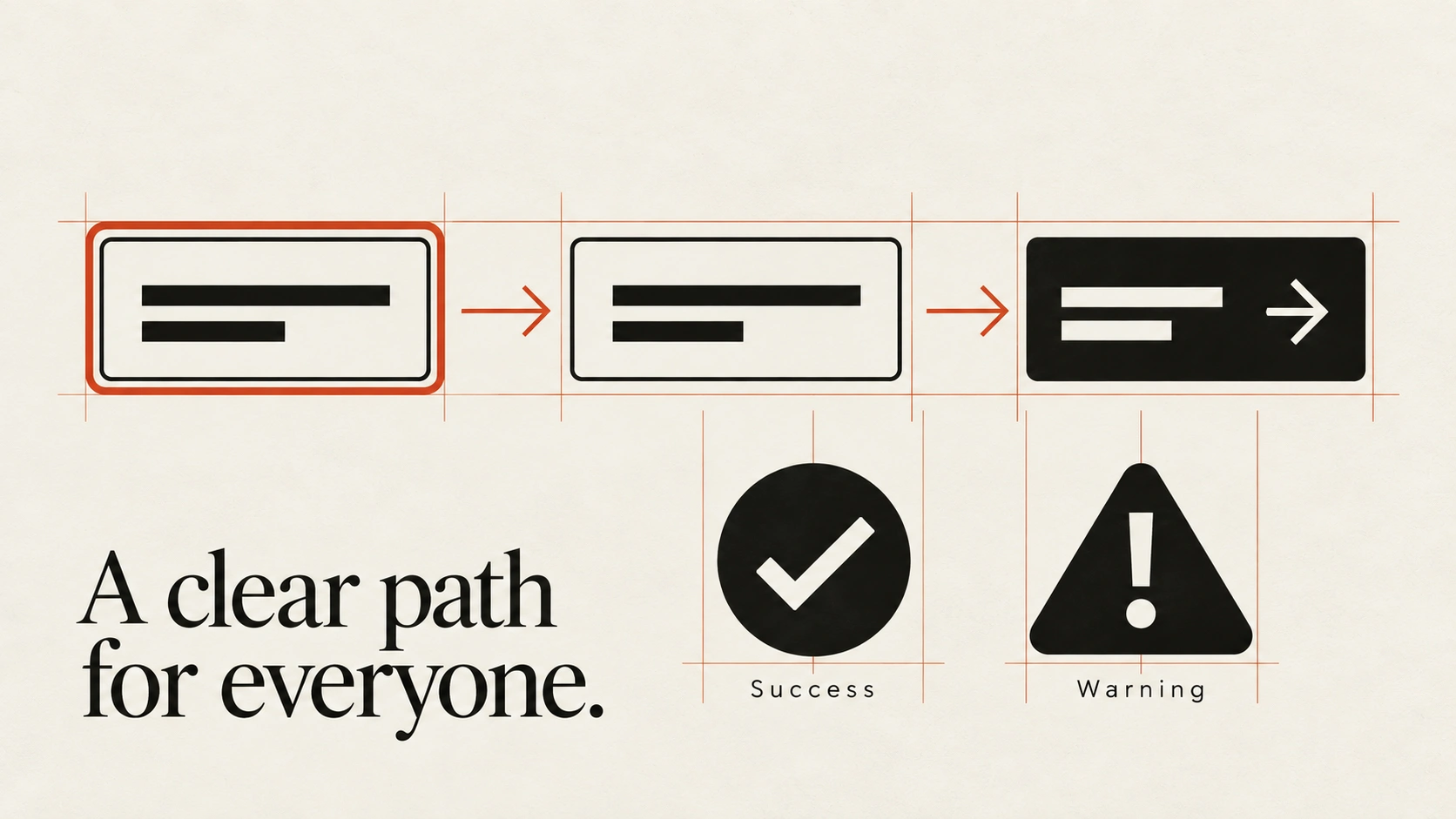
A visible focus ring and arrows trace navigation through controls; distinct success and warning symbols communicate without colour.
Principle 1 of 4 · 01Full entry

Use elements that match their purpose

The idea

Choose native controls where they meet the task.

Use a button for an action and a link with a destination for navigation. Their built-in semantics and behaviour reduce the amount of keyboard and assistive-technology support you need to recreate.

Structure the document with meaningful headings, lists and landmarks. Give form fields persistent labels and associate helpful instructions with their controls. Custom widgets sometimes need additional behaviour and ARIA, but an accessible name alone does not make a widget complete. Check its keyboard interaction and state announcements too.

How to see it

Similar-looking elements can have different behaviour. A native button provides semantics that a styled div does not supply on its own.

Terms used in this lesson

The parts

Semantics
The meaning conveyed by an element's role and structure.
Accessible name
The name assistive technology uses to identify a control.
Native control
A built-in HTML control with established browser behaviour.

In practice

  • Use native elements where appropriate
  • Give controls meaningful labels
  • Test custom behaviour with a keyboard

Avoid

  • Choosing heading levels for visual size
  • Click handlers on otherwise inert elements
  • Assuming an ARIA role supplies keyboard behaviour
Test

Inspect the page outline and complete the main task with a keyboard and screen reader. Do the names, roles and states describe the interface accurately?
Principle 2 of 4 · 02Full entry

Pair colour with another signal

The idea

Colour can highlight an error or distinguish a chart series, but people should not need to identify the hue to understand the message.

Add a clear label, pattern, icon or other cue that preserves the meaning.

For forms, explain an error near the relevant field and connect the message to the control. For charts, use direct labels or distinguishable marks. For text links, an underline is a clear starting point. A greyscale or colour-vision simulation can reveal problems, but it does not replace checking the complete experience.

How to see it

Labels and symbols preserve the distinction when the colours are difficult to tell apart.

Terms used in this lesson

The parts

Second cue
A text or shape signal that accompanies colour.
Direct label
A label placed with the item it describes.
Status message
Text explaining a condition or result.

In practice

  • Explain errors in text
  • Distinguish chart series beyond hue
  • Make links recognisable within prose

Avoid

  • Red and green as the only status distinction
  • Unlabelled colour keys
  • Treating a simulation as complete user testing
Test

Remove colour temporarily. Can you still identify errors, selected items, links and chart series without guessing?

Use the Colour Vision Simulator to compare a screenshot under different colour-vision simulations. Use the result to find missing labels or other cues, alongside user testing.

Principle 3 of 4 · 03Full entry

Make the whole task keyboard-accessible

The idea

People must be able to operate the interface without relying on a pointer.

Test the complete task, including opening menus, choosing values, submitting forms and recovering from errors. Keyboard patterns differ by control: Tab moves between controls, while some widgets use arrow keys within them.

Keep focus visible and avoid obscuring the active control with fixed content. A modal dialog needs managed focus while it is open and an appropriate return point when it closes. Provide alternatives to interactions that require dragging, and test custom widgets rather than assuming their appearance proves their behaviour.

How to see it

Visible focus helps a keyboard user locate the active control. Check the whole route through the task.

Terms used in this lesson

The parts

Focus
The element currently receiving keyboard input.
Focus indicator
The visible mark identifying that element.
Modal
A temporary interaction that restricts access to the surrounding page.

In practice

  • Test full tasks without a pointer
  • Keep focus visible and unobscured
  • Manage focus in modal interactions

Avoid

  • Removing focus styling without a replacement
  • Hover-only access to essential controls
  • Drag-only actions without an alternative
Test

Complete the main task using only the keyboard. Can you always find focus, reach the next action and leave a temporary menu or dialog?

Principle 4 of 4 · 04Full entry

Test beyond the automated report

The idea

Automated checks can detect some accessibility issues, but a clean report cannot establish that an experience works for everyone.

Meaningful labels, understandable reading order and successful task completion need human evaluation as well.

Test representative flows with the relevant assistive technologies and include people who use them. Listen to the names and states of controls, check error recovery and review image descriptions in context. Record the task, environment and observed problem so fixes can be verified. There is no single reliable percentage of issues that every tool will catch.

How to see it

The automated report and the spoken experience answer different questions. Use both, along with user evaluation.

Terms used in this lesson

The parts

Automated check
A tool-based test for detectable issues.
Screen reader
Software that presents interface information through speech or braille.
Task evaluation
Observing whether someone can achieve a realistic goal.

In practice

  • Combine automated and manual evaluation
  • Test error and recovery paths
  • Include experienced assistive-technology users

Avoid

  • Treating a clean report as proof of access
  • Unhelpful names and image descriptions
  • Announcing every minor update unnecessarily
Test

Complete a real task with a screen reader, including an error and recovery. Record where the information or next action becomes unclear, then retest after the fix.

Access, in practice

View full size ↗
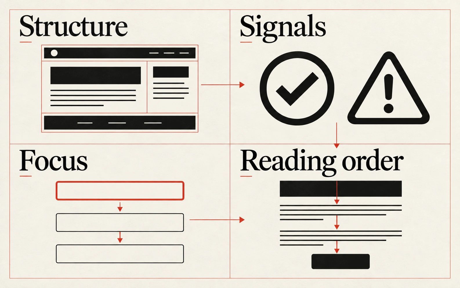
Four visual examples of access: use elements that match their purpose; pair colour with another signal; make the whole task keyboard-accessible; test beyond the automated report.

Four principles at a glance

  1. 01

    Use elements that match their purpose

    Build the meaning and behaviour of the page before refining its appearance.

  2. 02

    Pair colour with another signal

    Make important meaning available through text, shape or another visible cue.

  3. 03

    Make the whole task keyboard-accessible

    Keep controls reachable, focus visible and navigation predictable.

  4. 04

    Test beyond the automated report

    Combine automated checks with manual evaluation and feedback from users.

Apply it

Score your work against this discipline.

An audit reviews what you have shipped against all ten disciplines, tested with assistive technology and on real hardware, and returns a prioritised plan.