08 / Signature

Brand & Identity

Create an identity that stays recognisable across real applications. Define the visual and verbal choices, test demanding formats and give others usable guidance.

Brand & Identity specimen
Principle 2 of 4 · 02Full entry

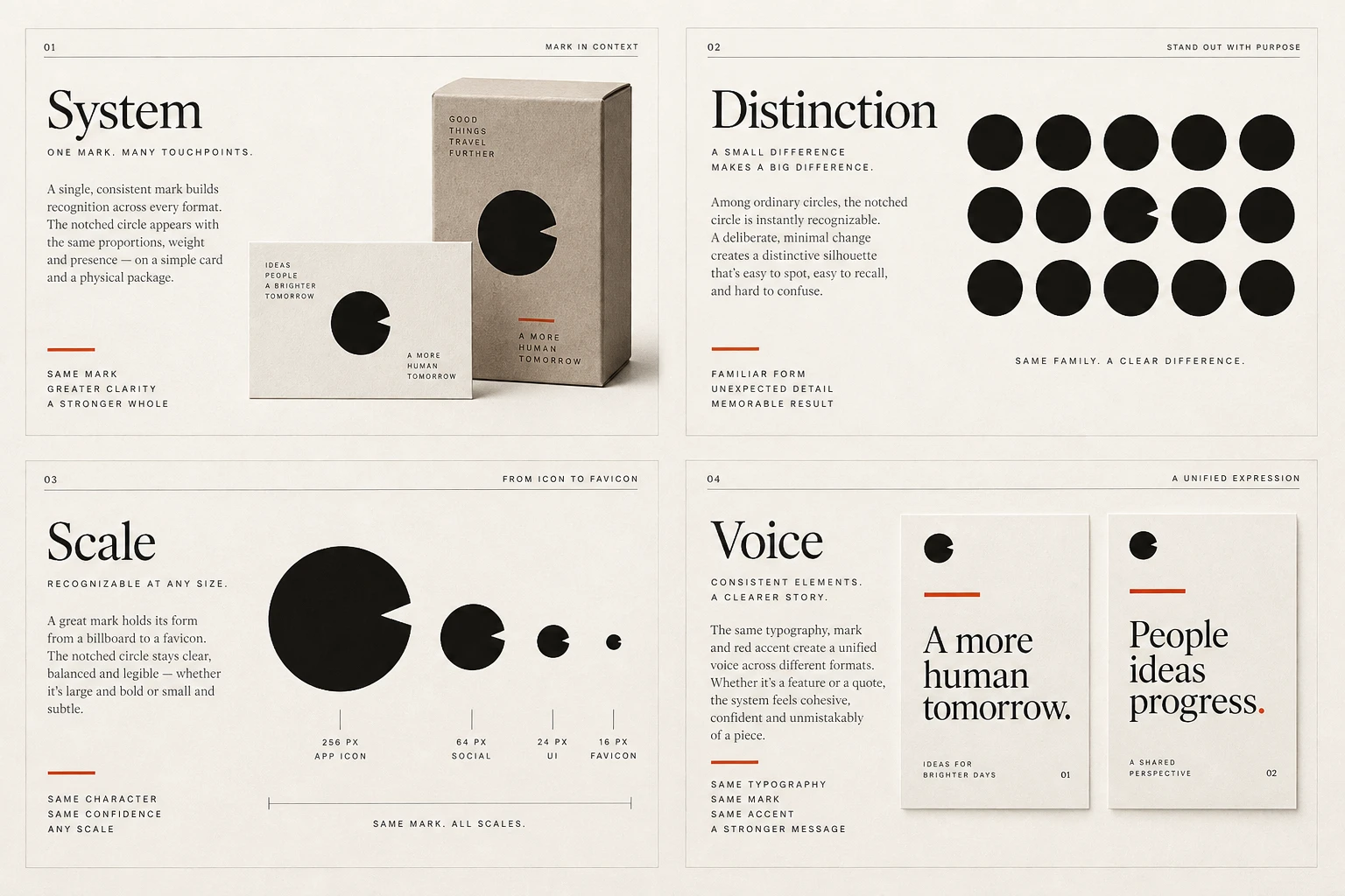
Build recognisable distinctions

The idea

An identity benefits from features people can remember: a shape, type treatment, colour relationship or image approach.

Review the surrounding category to understand where conventions help recognition and where the work risks becoming interchangeable.

Choose distinctions that fit the organisation and can be used consistently. Being different is not sufficient if the result is hard to read or unsuitable for its context. Test recognition with the intended audience rather than assuming that the design team's preference predicts familiarity.

How to see it

A distinct feature can help an identity stand out. Test whether it supports recognition with the intended audience.

Terms used in this lesson

The parts

Distinctive feature
A recurring element that helps recognition.
Category
The comparable organisations or products surrounding the identity.
Recognition
The ability to identify something from previous exposure.

In practice

  • Review the surrounding category
  • Repeat useful identity features consistently
  • Test recognition with the intended audience

Avoid

  • Difference that reduces legibility
  • Assuming preference predicts recognition
  • Treating a colour as uniquely owned without evidence
Test

Show several applications alongside comparable organisations. Which features help people recognise yours, and do those features remain useful in smaller or simpler formats?

Principle 3 of 4 · 03Full entry

Test the demanding formats early

The idea

Presentation size can hide weaknesses that appear in a favicon, a small label or a single-colour print.

Identify the formats the identity will actually use and include the most demanding ones early in development.

Create variants when necessary rather than expecting one file to work everywhere. A compact symbol may suit a small icon while a full wordmark needs more space. Check physical production with the relevant supplier; success at screen size does not guarantee success in embroidery or engraving.

How to see it

Small and single-colour uses reveal different constraints from a large presentation. Supply variants when needed.

Terms used in this lesson

The parts

Variant
A version adapted to a particular use.
Minimum size
The smallest tested size for a specified asset.
Production test
A sample made using the intended output process.

In practice

  • List the formats the identity must serve
  • Test constrained uses early
  • Supply appropriate variants

Avoid

  • Approving only at presentation size
  • Assuming one small-screen test covers production
  • Letting others improvise missing variants
Test

Review the smallest digital use and a realistic production sample. Is the identity recognisable, and are the correct variants easy to choose?

Principle 4 of 4 · 04Full entry

Give your brand a consistent voice

The idea

Writing is part of the experience people have with an organisation.

A useful voice guide explains how to make messages clear and recognisable in ordinary situations, including forms, invoices, support replies and announcements.

Show examples with a reason for each choice. A marketing introduction can have more personality than an error message, where the problem and next step should come first. Define what remains consistent while allowing the tone to respond to the reader's situation.

How to see it

Compare a vague failure message with wording that identifies the problem and gives a next step.

Terms used in this lesson

The parts

Voice
The consistent character of an organisation's writing.
Tone
The adjustment made for a particular situation.
Next step
The action or information someone needs after reading a message.

In practice

  • Show examples from emails, product screens and support replies.
  • Explain what makes each example clear and appropriate for your brand.
  • Adapt the tone to the situation. Error messages should explain what happened and what to do next.

Avoid

  • Adjective lists without examples
  • Personality that obscures error recovery
  • A guide that only covers marketing headlines
Test

Give two writers the same customer scenario and your voice guide. Both responses should explain the next step clearly and sound like they come from the same brand.

Brand & Identity, in practice

View full size ↗
Four visual examples of brand & identity: build an identity others can use; build recognisable distinctions; test the demanding formats early; give your brand a consistent voice.

Four principles at a glance

  1. 01

    Build an identity others can use

    Deliver the rules and examples that support consistent new work.

  2. 02

    Build recognisable distinctions

    Choose visual features that help people recognise the identity over time.

  3. 03

    Test the demanding formats early

    Check the identity where detail, space or reproduction is constrained.

  4. 04

    Give your brand a consistent voice

    Define how your brand writes, from product messages to customer support. Give your team examples they can use.

Apply it

Score your work against this discipline.

An audit reviews what you have shipped against all ten disciplines, tested with assistive technology and on real hardware, and returns a prioritised plan.