
07 / Interaction

Interface

Design the complete task, including waiting, errors and recovery. Make controls easy to operate and protect the work people have already done.

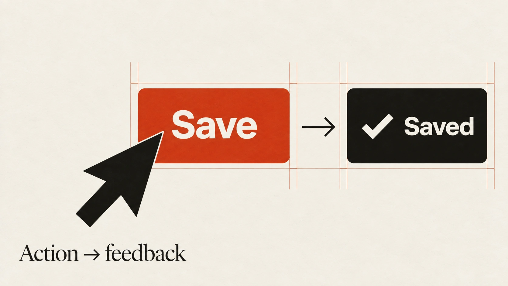
A pointer activates Save, followed by a checkmark and Saved confirmation: action and feedback.
Principle 1 of 4 · 01Full entry

Design the full set of states

The idea

A finished screen is only one part of an interface.

People also encounter empty lists, slow requests, partial results, errors and content that does not fit the ideal layout. These states need enough information to explain what is happening and what to do next.

Map the transitions around a real task. Distinguish an empty account from a search with no matches, and a retryable failure from a permission problem. Use realistic long names and large datasets to check wrapping and overflow. Keep existing work visible when a temporary problem does not require removing it.

How to see it

One list across several states. Each state needs a clear explanation or next step where appropriate.

Terms used in this lesson

The parts

Empty
No content is available in the current context.
Loading
An operation is still pending.
Overflow
Content exceeds the space anticipated by the layout.

In practice

  • Map states around a complete task
  • Use long and missing content in review
  • Offer a relevant recovery action

Avoid

  • Treating every empty state the same
  • Removing useful data after a temporary error
  • Designing only the ideal screenshot
Test

Walk through the task with no data, a delayed response, a failure and unusually long content. Is there a clear next step in each case?
Principle 2 of 4 · 02Full entry

Make controls easy to hit

The idea

A small icon can sit inside a larger clickable area.

Give controls enough room to activate without accidentally hitting a neighbour, especially on touch screens. Check the real hit area rather than judging the artwork alone.

WCAG 2.2 Level AA specifies a minimum target size of 24 by 24 CSS pixels, with exceptions including qualifying spacing and inline targets. A 44 by 44 target can be a useful touch design goal, but it is not a universal AA requirement. Review the applicable criterion and test the finished controls in context.

How to see it

The visible icon is unchanged, but the larger interactive area gives more room to activate it. Check adjacent targets too.

Terms used in this lesson

The parts

Hit area
The area that responds to pointer or touch input.
Icon
The visible symbol within a control.
Separation
Space that helps prevent activation of a neighbouring control.

In practice

  • Inspect the actual interactive area
  • Leave enough separation between controls
  • Test touch use on a real device

Avoid

  • Hit areas that overlap neighbouring controls
  • Confusing icon size with target size
  • Presenting a design goal as a universal standard
Test

Use the interface on a phone and inspect each control's hit area. Can you activate neighbouring actions reliably without overlap or accidental selection?

Principle 3 of 4 · 03Full entry

Make waiting understandable

The idea

After someone activates a control, the interface should make clear that the action was received.

Feedback might be a pressed state, a pending label or an updated view. Avoid leaving a silent gap that encourages repeated submissions.

For longer work, explain what is happening and provide accurate progress when it is available. Do not invent a percentage when the system cannot measure it. Let people cancel or return later when the operation supports that safely. If an optimistic update fails, preserve their input and explain how to recover.

How to see it

Short and long waits need appropriate feedback. Timing examples are guides; the message should reflect the actual operation.

Terms used in this lesson

The parts

Acknowledgement
Immediate feedback that input was received.
Progress
An accurate indication of work completed or remaining.
Optimistic update
A provisional result shown before server confirmation, with a recovery path if it fails.

In practice

  • Acknowledge input promptly
  • Show accurate pending and failure states
  • Preserve input when a request fails

Avoid

  • Silent waits that invite repeat submissions
  • Invented progress percentages
  • Optimistic updates without a recovery path
Test

Test the flow on a slow connection and force a failed request. Can you tell whether the action is pending, complete or failed, and what to do next?

Principle 4 of 4 · 04Full entry

Protect the work people have done

The idea

A network failure, accidental navigation or mistaken deletion should not casually erase useful work.

Decide which changes need a draft, recovery history or undo, and make the saved state accurate. Show a save failure rather than implying that unsaved work is safe.

Match the recovery mechanism to the consequence. Undo works well for reversible edits; an irreversible action may need a specific confirmation naming what will be lost. Draft storage also needs an appropriate retention and privacy policy. Do not persist sensitive inputs indiscriminately or restore stale content without context.

How to see it

Undo provides recovery for reversible mistakes. Confirmation remains useful when the consequence cannot be safely reversed.

Terms used in this lesson

The parts

Draft
A recoverable version of unfinished work.
Undo
A way to reverse a supported action.
Confirmation
A deliberate check before a consequential action.

In practice

  • Show whether changes are saved
  • Provide appropriate draft or undo support
  • Name the consequence of irreversible actions

Avoid

  • Claiming a failed save succeeded
  • Persisting sensitive inputs indiscriminately
  • Using generic confirmations for every small edit
Test

Interrupt a save, reload the page and make a reversible mistake. Does the interface preserve the expected work and explain any limits to recovery?

Interface, in practice

View full size ↗
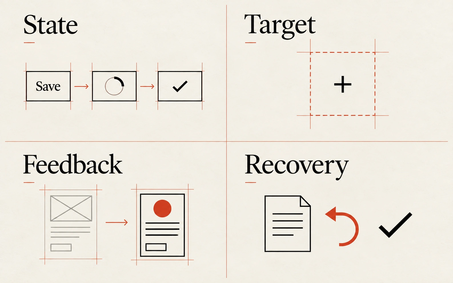
Four visual examples of interface: design the full set of states; make controls easy to hit; make waiting understandable; protect the work people have done.

Four principles at a glance

  1. 01

    Design the full set of states

    Show what happens before, during and after the successful result.

  2. 02

    Make controls easy to hit

    Design the interactive area and spacing, not just the visible icon.

  3. 03

    Make waiting understandable

    Acknowledge actions promptly and show the real state of longer work.

  4. 04

    Protect the work people have done

    Preserve recoverable input and make destructive actions clear.

Apply it

Score your work against this discipline.

An audit reviews what you have shipped against all ten disciplines, tested with assistive technology and on real hardware, and returns a prioritised plan.