
An identity that survivesthe people who made it

Eleven neighbours had converged on the same blue node. Verso's staff could not pick their own mark out of a lineup. We drew one that survives a sleeve, a stamp, and a retraction email.

  • Identity
  • Verbal
  • 2025
  • 31 templates
  • 16 px
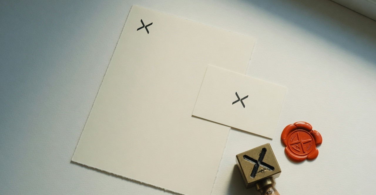
Cream letterhead and card with a split-X mark, a matching brass stamp and vermilion wax seal.
Fig. 01. One mark, on paper, metal and wax.

The brief

Their own staff could not pick the old mark out of a lineup of twelve. Competence is not a strategy when the category has already agreed on the same blue.

Verso's previous identity was competent and completely unmemorable. It sat inside a category where eleven organisations had converged on the same blue, the same grotesque, and the same abstract node. The board wanted something prettier. The work was to occupy the one piece of territory nobody else was standing on, then write the voice that could survive a retraction.

Fig. 02

Eleven neighbours. One unoccupied seat.

Same scale, same sitting. The category had already agreed on a blue node. Pretty, in this row, is just another circle.

Apex
Helion
Northwell
Kite
Orbis
Field
Harbor
Nave
Pylon
Sable
Lumen
Verso

The approach

The category audit did the strategy. Lined up at the same size, the neighbours were one mark. That sheet, not a moodboard, is what we took into a risk-averse board. Distinctive beats pretty because pretty, in this category, is already taken.

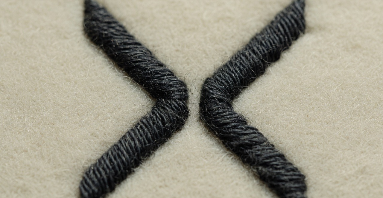
The mark was drawn at 16px, one colour, before it was ever seen large. Then embroidered, stamped, and cropped to a circle. The small-size drawing is a drawing, not a scale-down. If it fails on a sleeve, it is not a mark.

Voice was written with the marks, from real surfaces: a funding decline, a correction, the announcement of a retracted paper. The easy messages will take care of themselves. The difficult ones are the identity.

Fig. 03

Drawn at 16px, then made.

If it fails on a sleeve, it is not a mark. The small-size drawing is a drawing, not a scale-down. Then paper, brass, wax.

Close-up of the split-X mark stitched in dark thread on cream wool.
01Embroidered, one colour
Cream letterhead and card with a split-X mark, a matching brass stamp and vermilion wax seal.
02Paper, brass, wax

Fig. 04

The difficult messages were designed first.

Launch copy will take care of itself. A mark that cannot survive a retraction is decoration. These are two real surfaces, rewritten.

01 Funding decline

Before

We regret to inform you that, after careful consideration, your application has not been successful on this occasion. We receive many excellent proposals and competition is always strong.

After

We are not funding this. The work is clear. The case for it, in this round, is not. You may write again in March. Please do not write to ask us to say more than that.
02 Correction

Before

An earlier version of this page contained an inaccuracy. We apologise for any confusion caused and have updated the information below.

After

We published the wrong figure for enrolment. The correct number is 1,204. The error was ours. It is corrected here, dated.

The outcome

1 in 12

Recognised it unbranded

Up from 1 in 47. Same lineup test, after the system shipped.

  1. 16 px

    Smallest size it was drawn

    Not scaled. A separate drawing, one colour, for the size a sleeve actually sees.

  2. 31

    Templates shipped

    Letter, slide, paper, email. The PDF was a by-product, not the deliverable.

  3. 0

    Off-brand escalations

    First two quarters. The system was usable without a brand cop.

Held to

Three laws from the canon, applied on this job rather than cited after it.

  • 01

    Distinctive beats pretty

    Fig. 02 is the strategy. Eleven neighbours, one blue. Verso is the split in the row, not a nicer version of the same circle.

    Read the law →
  • 02

    Design the worst case first

    The mark was drawn at 16px and embroidered before it was allowed on a title page. The voice was written as a retraction before it was written as a launch.

    Read the law →
  • 03

    Write the voice with the marks

    Fig. 04 is the same funding decline, twice. If the letter cannot carry the mark, the mark is decoration.

    Read the law →

Next project

Making a 3D product configurator work on mobile

Coastline · 2025

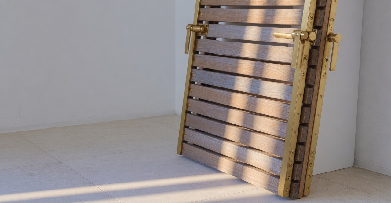
A timber and brass louvre panel in raking gallery light.
Start

Something similar in front of you?

Describe the problem rather than the solution. We reply within two working days and will tell you honestly whether this is work we should take.