
Composition · 03 of 04
Choose clear alignment points
Use shared edges to make related content easier to scan.
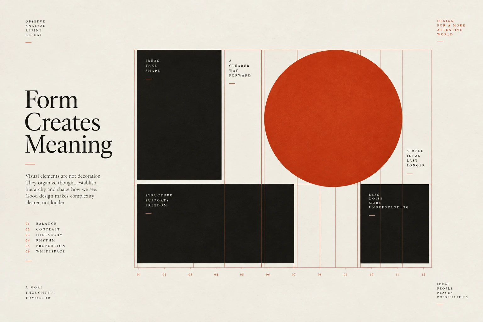
The idea
Alignment creates a path through a page.
Repeated left edges help readers move between headings and paragraphs; aligned columns make values easier to compare. Near-matches can look accidental, so choose the reference edge for each group deliberately.
Different content can need different alignment. Text often benefits from a shared starting edge, while numbers in a table may need decimal or right alignment. Check visible shapes as well as their containers, and avoid forcing unrelated elements onto one axis just to make the measurements match.
How to see it
Terms used in this lesson
The parts
- Axis
- A shared alignment line.
- Edge
- The visible or structural boundary used as a reference.
- Optical correction
- A small adjustment to improve the perceived alignment.
In practice
- Choose reference edges for related groups
- Align numbers for comparison where useful
- Check optical alignment of icons and text
Avoid
- Nearly matching edges without a reason
- Forcing unrelated content onto one axis
- Using alignment that makes values harder to compare
The test
Trace the main edges through the page. Can you explain what each alignment helps the reader compare or follow?
Sources
- Jan TschicholdThe New Typography 1928
- Josef Müller-BrockmannGrid Systems in Graphic Design 1981
- Jakob NielsenF-Shaped Pattern For Reading Web Content 2006
Reviewed against all forty, on your product.
The audit is the cheapest thing we sell, and it regularly concludes that you do not need the project you came for.