
Composition · 01 of 04
Use the grid to make emphasis deliberate
Establish a consistent layout before choosing where to depart from it.
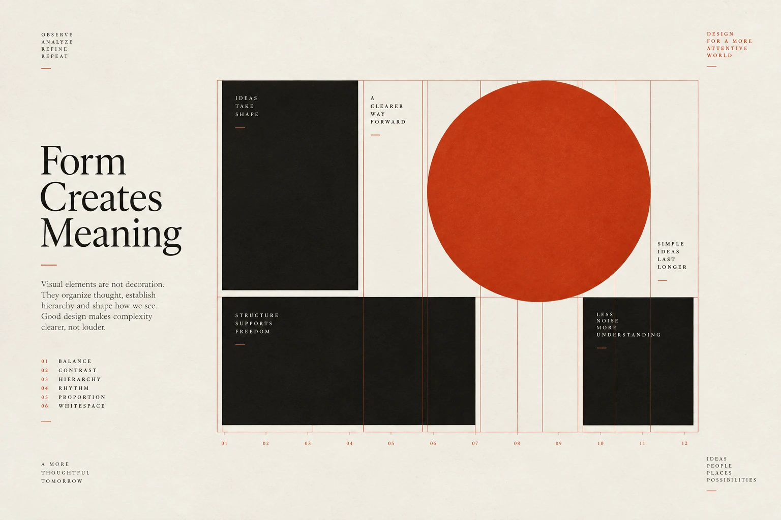
The idea
A grid gives text and images shared edges and repeatable spacing.
Those relationships make a page easier to scan and extend. Start by placing the ordinary content clearly; then decide whether a particular image or statement would benefit from a deliberate departure.
An oversized image or offset heading can create emphasis when the surrounding layout is stable. The number of departures is a design decision, not a rule that every page must break exactly once. Each exception should have a purpose and still work at narrower widths, with a sensible reading order.
How to see it
Terms used in this lesson
The parts
- Grid
- A set of layout guides for positioning content.
- Gutter
- The space between columns.
- Departure
- A deliberate exception to an established alignment.
In practice
- Establish shared columns and spacing
- Give departures an explicit purpose
- Check reading order at narrow widths
Avoid
- Adding offsets without a content reason
- Forcing every page to include a grid break
- Overlaps that obscure text or controls
The test
Show the layout guides and explain each departure. Does it emphasise something useful, and does it remain clear on a phone?
Sources
- Josef Müller-BrockmannGrid Systems in Graphic Design 1981
- Jan TschicholdThe New Typography 1928
- Rudolf ArnheimArt and Visual Perception 1974
Reviewed against all forty, on your product.
The audit is the cheapest thing we sell, and it regularly concludes that you do not need the project you came for.